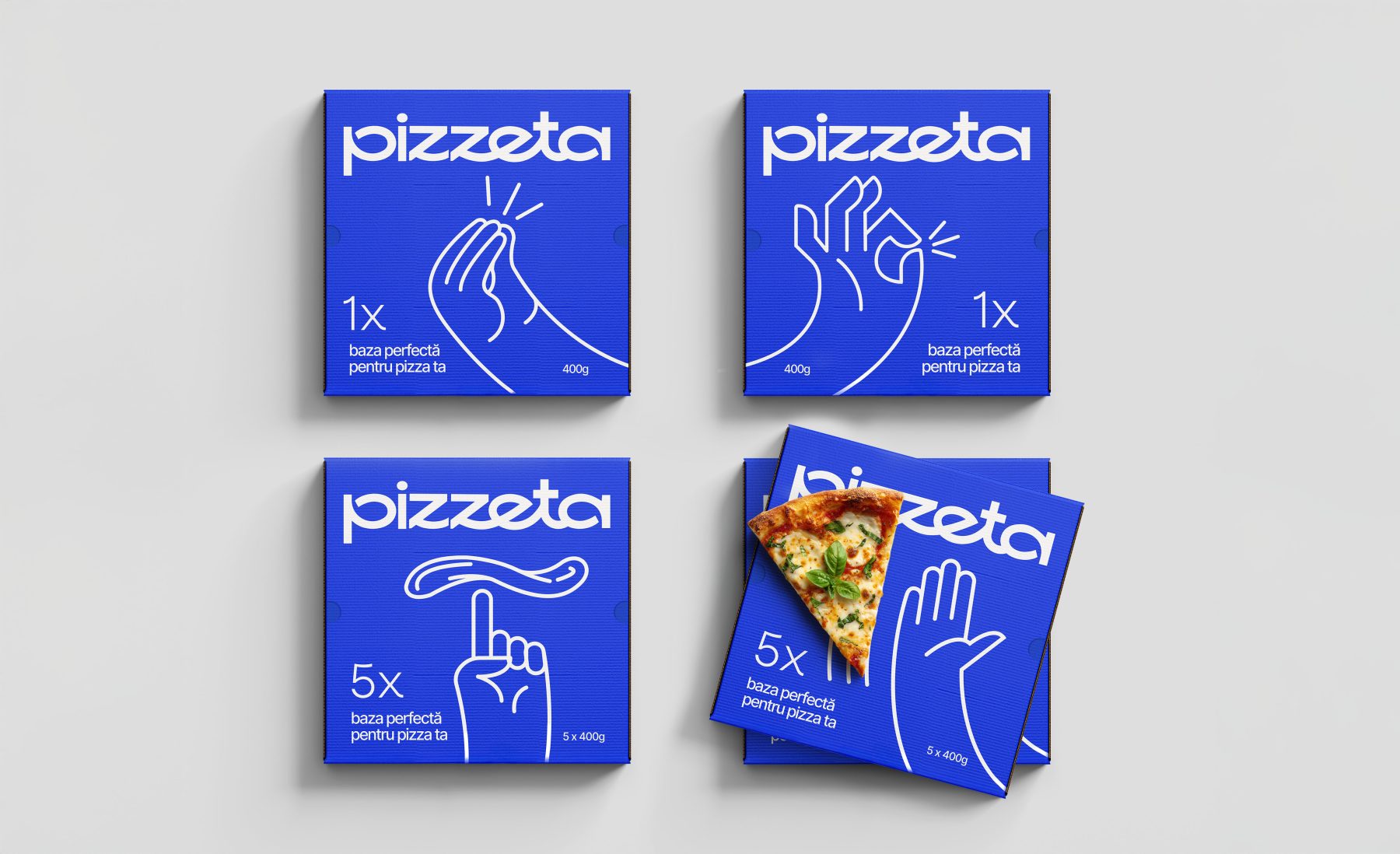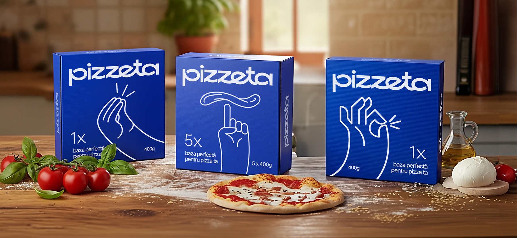
Pizzeta is an artisanal pizza base, carefully crafted from natural ingredients and without compromise. Created through slow fermentation, Pizzeta delivers the perfect texture – crispy on the outside, soft on the inside – and the authentic taste of Italian pizza, right at home. The challenge for the BroHouse team was to capture this authentic simplicity in a memorable brand: to create a familiar, friendly name, a logo that breathes naturalness, and packaging that communicates ease and the joy of effortless cooking.
Pizzeta
Sector
Refrigerated Products
Services
Brand Strategy
Brand Positioning
Naming
Logo Design
Packaging Design
DTP
Pizzeta
A name with the true taste of pizza
In a market where pizza has become a universal symbol of joy, the challenge was to find a name that doesn’t reinvent tradition but expresses it naturally. The naming process for Pizzeta started from the Everyman archetype – a guide to accessibility, to things made simply and done well. We analyzed familiar language and searched for a sound that conveys warmth, trust, and closeness. No gimmicks, no pretension – just the perfect balance between authenticity and clarity. Thus, Pizzeta took shape as a friendly phonetic solution, a warm diminutive that brings forward the emotion of the product: an artisanal, simple, and natural base, ready to become the starting point of an easy and authentic cooking experience.
A name carefully kneaded
Beyond functionality, Pizzeta evokes a sense of comfort and familiarity, building an immediate emotional connection. The name suggests care, closeness, and the joy of shared moments – essential values for brands that live through experience, not through price or status. It’s a demonstration of how a single short word can encapsulate an entire positioning strategy: simplicity, naturalness, and everyday inspiration. In Pizzeta, the science of naming meets the emotion of branding – and the result is an identity that doesn’t impose, but invites.
Words become symbols
The Pizzeta logo is a statement: a wordmark that carries the taste of Italy in the shape of its letters. It’s inspired by the gestures, rhythm, and natural elegance of Italian life – clean, warm, and authentic. The letterforms are balanced and fluid, capturing that effortless Italian style and graceful movement. We went minimalist: a pure wordmark, no extra graphic tricks, because the name already has its own personality and musicality. In a visual category full of clichés – bright red, round shapes, predictable icons – Pizzeta chooses calm. No pizza slice, no flame, no chef’s mustache – just letters. Letters that carry the brand’s warm tone and the understated elegance of an artisanal product.
Packaging that gestures Italian
The Pizzeta packaging takes the brand story further, turning simplicity into a visual gesture. We started from a universal truth: Italians don’t just talk – they communicate with their hands. Every hand movement is a language in itself – expressive, lively, and authentic. From this idea, we developed a series of minimalist illustrations that capture the iconic gestures of Italian conversations.
Design with gestures. And no words.
Each illustration is stripped down to its essence: fluid, clean, almost spontaneous lines, set against a flat blue background that gives freshness and visual consistency. The result is packaging that doesn’t need Mediterranean clichés to feel Italian. It speaks through the language of expression – simple, elegant, and memorable. A visual identity that blends the clarity of contemporary design with the unmistakable warmth of the Italian spirit.
Did you enjoy what we created for Pizzeta?
Discover our branding for Green or the packaging design for GoBar. If you’d like to discuss how we can transform your brand too, visit our contact page. You can explore more stories about our award-winning projects — including SanoVita – Pentawards Bronze, CridaPharm – Pentawards Bronze, and Blue – Transform Awards Europe — on our blog.