


The approval meeting. Six people around a logo, seven opinions. Someone says, “I don’t like green.” Someone else says it looks too serious, and whoever speaks last, and loudest, wins.
That’s how the myth that design is subjective survives. It’s comfortable, because it spares everyone the hard question: what problem is this design supposed to solve? If the answer is “it looks good,” you don’t have a solution. You have a preference.
Tastes can be subjective. Design, however, has to solve concrete problems, and effective design rests on strategy, business goals, audience needs and measurable results. In this article we show why the myth sticks, what it replaces in your meetings and how to judge a design by what works, not by what we like.
Is design subjective? Only your taste is
Personal preference exists, and nobody argues with that. The problem starts when it replaces criteria. There’s nothing wrong with having taste, but it’s expensive to bring it to the meeting in place of goals.
What belongs to preference and what belongs to function
Preference answers “do I like it?” Function answers “does it do the job?”
A logo can delight you and vanish on the shelf beside four competitors, or miss your taste and still get recognized instantly. The first case is a taste decision. The second is a business result.
Why the myth survives: everyone can see, so everyone feels qualified
Nobody has opinions about how to weld a steel frame, but everybody has one about a logo. Design is visible, and what’s visible feels easy to judge. That’s how every opinion ends up weighing as much as expertise.
There’s another reason: taste is free. An opinion needs no research, no analysis and no answer to the brief, so it wins through simplicity.
Art invites interpretation, design has to communicate clearly
Art lets the audience wonder what the artist meant. Design can’t afford that. If a package or an identity needs explaining, it hasn’t done its job, and you’ve paid for something that comes with footnotes.
Why “I don’t like blue” isn’t design feedback
Good feedback moves the design toward the goal. Taste-based feedback moves it toward whoever is talking.
What happens when taste decides
The typical outcome is a compromise built from six tastes: nobody’s upset, nobody’s excited, and the market doesn’t notice. Every change makes sense on its own. Together, they erase exactly what made the brand different.
That’s how solid identities turn anonymous after a single round of taste-driven revisions.
The right question: does it solve the problem?
Swap “do I like it?” for “does it get us to the goal?” If blue doesn’t excite you, ask whether it sets the brand apart from competitors and whether your audience links it to what you promise. Useful feedback is verifiable: after the change, you can say whether the problem got solved or not.
We wrote separately about why the wrong feedback destroys brands.
First impressions are fast, but they’re not a whim
In a study reported by Nature, researchers showed that people judge the visual appeal of a web page in about 50 milliseconds. More importantly, that first impression colors the judgments that follow. The conclusion isn’t that taste decides. It’s that appearance works through a perception mechanism you can design for, not through a lottery.
What does effective brand design actually solve?
Effective brand design starts from a stated problem, not from a color palette. The opening question is “what has to change in the business after launch?”, not “which color is trending?”
Strategy comes before pixels
Before any sketch, you define your brand positioning: who you speak to, what sets you apart, what you want your audience to feel and do. Design translates that decision into a visual language. Without it, the designer guesses, and you end up voting on the guess.
The brief is the first evaluation criterion
A clear brief states what you need to achieve, for whom and in what context. You then judge every proposal against it, not against the mood in the room. Without a brief, every proposal looks right and every criticism looks fair.
We explain why every branding project starts with a brief in a dedicated article.
The SanoVita case: the design convinced the client, not the other way around
On the VegieLife project for SanoVita, the client’s team told us from day one that, no matter how hard they push with requirements, the designer has to convince them, not the reverse. Beniamin Dan, Marketing Manager at SanoVita, ties the medals directly to that principle. The partnership has lasted seven years, and the design won Bronze at Pentawards 2020.
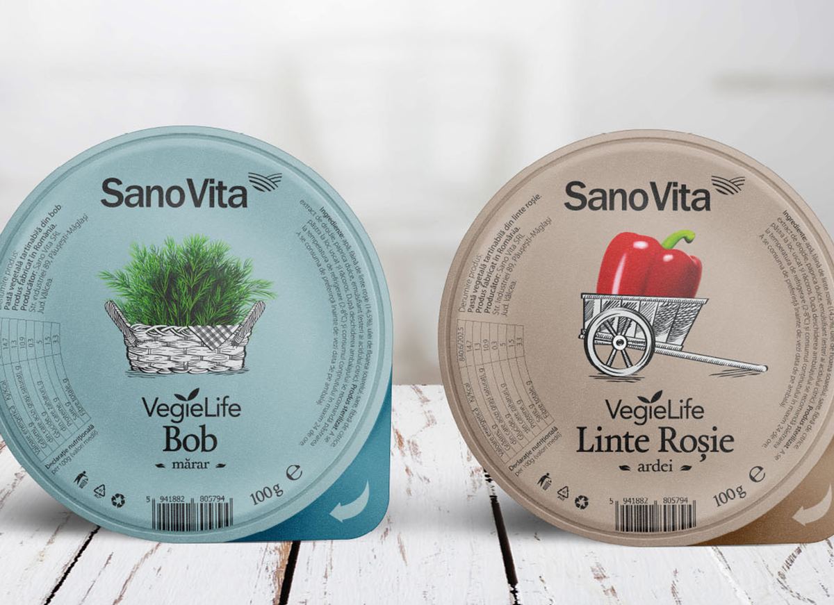
VegieLife for SanoVita: the design convinced the client and won Bronze at Pentawards 2020
If design isn’t subjective, how do you measure good design?
Measurable doesn’t mean putting a number on every line. It means knowing in advance what you’ll judge the result by.
Criteria set before creation
Write down the goals, the audience and the competitive context before you see the first proposal. Then judge every option against the same criteria, in the same order. Criteria don’t kill creativity. They point it at something that matters.
A Toptal article on the design process notes that research limits the pull of personal opinions, which is exactly what written criteria are for.
What to look at: clarity, recognition, consistency, results
Ask whether people understand the message immediately, whether the brand stands out next to competitors, whether the system stays coherent across every touchpoint and whether business indicators move in the right direction. Each criterion has a verifiable answer, even when it doesn’t come as a single number. Sales, shelf recognition and conversion are numbers. You test clarity with people from your audience.
What the research says about design that performs
A McKinsey study tracked 300 listed companies over five years. Those in the top quartile of its design index grew revenue 32 percentage points more, and shareholder returns 56 percentage points more, than their industry peers.
It’s a correlation, not proof of causation, but it shows that design treated as a business discipline shows up in the numbers, across consumer goods, retail banking and medical devices.
It also matters when the verdict comes from outside the team. At Transform Awards Europe 2025, BroHouse won Gold for Best Visual Identity in the Transport and Logistics sector, for Blue, the ride-sharing app from Autonom Group. That was an independent jury, not the preferences in a meeting room.
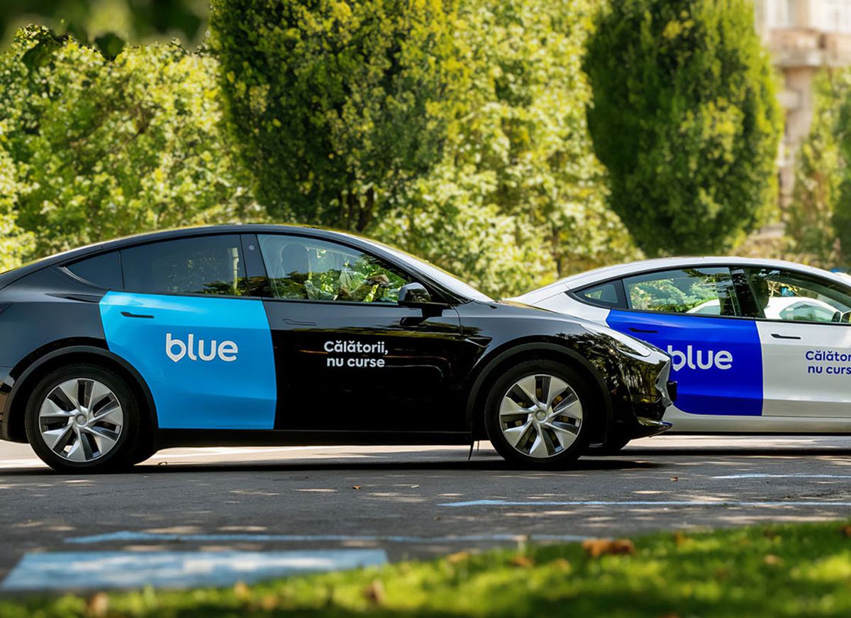
Blue, the ride-sharing app from Autonom Group: Gold for Best Visual Identity at Transform Awards Europe 2025
If design isn’t subjective, does aesthetics still matter?
It does, but it does a different job than you think. Aesthetics doesn’t decide whether a design is good, but it shapes how fast, and how much, you trust it.
The aesthetic-usability effect: why beauty earns trust
The aesthetic-usability effect, described by Nielsen Norman Group, shows that people perceive pleasing design as easier to use and forgive minor flaws more readily. The original 1995 research tested 26 ATM interface variations with 252 participants. Beauty opens the door, but it doesn’t hold the building up.
A first impression comes from looks, but long-term trust comes from experience. A beautiful pack that’s hard to open, or an elegant identity that doesn’t read on a banner, costs you the customer however good it looks.
Beautiful without strategy is packaging without a product
The same effect sometimes hides real problems instead of solving them: an attractive but confusing design loses the customer once the real issues surface. That’s why we treat logo design and visual identity as strategic decisions: first the role of the brand in the business, then the form. Aesthetics is a tool of strategy, not a substitute for it.
A control question: if you strip the aesthetics out of the equation, is there still a reason to choose your brand? If the answer is no, you have a strategy problem that no sketch will fix.
How do you make design decisions as a team without turning the meeting into a vote?
A vote measures how many people prefer something, not how well it works. A team that picks its design by vote usually picks the least disturbing option, not the most effective one.

A vote measures preference; criteria measure how well a design works
Who decides, and on what criteria
Settle from the start who has the final word and what it rests on. Usually the decision belongs to whoever owns the business goals, while the agency answers for the quality of the solution against the brief. Feedback comes as criteria: “it doesn’t stand out on the shelf” is feedback, “I don’t like it” isn’t.
A simple habit: ask every participant to phrase an objection as a problem, not a preference. “I’m worried it won’t read at a small size” can be checked. “I don’t like it” can’t.
Consistency as proof: the brand guidelines
Anyone can apply a design that works identically, at any time. Laura Mocanu, Customer Care Manager at Web Coffee, praised the brand identity we built for Web Coffee because the brand book is clear, easy to apply and full of precise rules for visual coherence. She valued the strategic thinking behind it, not only the aesthetics. Without written rules, consistency depends on the memory and the taste of everyone who touches the brand.
That’s what brand guidelines do: they turn decisions into rules.
Conclusion
Tastes can be subjective. Design has to solve problems, and the result shows in strategy, business goals, audience needs and measurable indicators. Aesthetics matters as a tool, not as a verdict. It’s not about what we like, it’s about what works.
At your next approval meeting, change one question: from “do we like it?” to “does it solve the problem?”
At BroHouse we start every project from the brief and the positioning, and design arrives as the answer, not as a bet. If a design decision is waiting on your desk, send us the brief or the project at brohouse.com and tell us what problem it has to solve. We’ll answer with criteria, not opinions.