YU is a new Romanian functional beverage: light, sparkling and built on a clean label, with no added sugar and no artificial additives. Four variants, Immunity, Relax, Focus and Essential, each made for a different moment of the day. Together with Hydrate Plus, we built the brand from zero: the name, the wordmark, the visual identity, the packaging system and the launch materials.

YU
Sector
Functional drinks
Services
Brand Strategy
Naming
Brand Positioning
Logo Design
Brand Book
PR Box & Box Tray
Packaging Design
DTP
YU – Functional Beverage Branding & Packaging
The shelf is shouting. YU doesn’t need to.
Functional drinks are one of the fastest-growing beverage categories, and the shelf shows it. Neon colours, oversized claims, energy-drink aggression. Every can fights for attention, so most of them end up in the same noise.
YU had a different product to sell. No added sugar, no artificial sweeteners, colours, flavours or preservatives. A drink for everyday well-being, not an energy drink and not a supplement. The brief followed naturally: if the product is clean, the brand has to be clean too. Our job was to make that honesty visible, and to make YU stand out precisely because it doesn’t shout.
Brand naming: a name that speaks to you
YU comes from “you”. Personal, young, direct. The name was built together by the BroHouse team and the client, and it does a lot with very little: two letters, one syllable, no explanation needed. It puts the consumer at the centre of the brand. The drink doesn’t talk about itself, it talks about how you want to feel. And it reads the same in Romanian and in English, which matters for a brand that launches in Romania and already looks beyond it.
Logo design: essence, not decoration
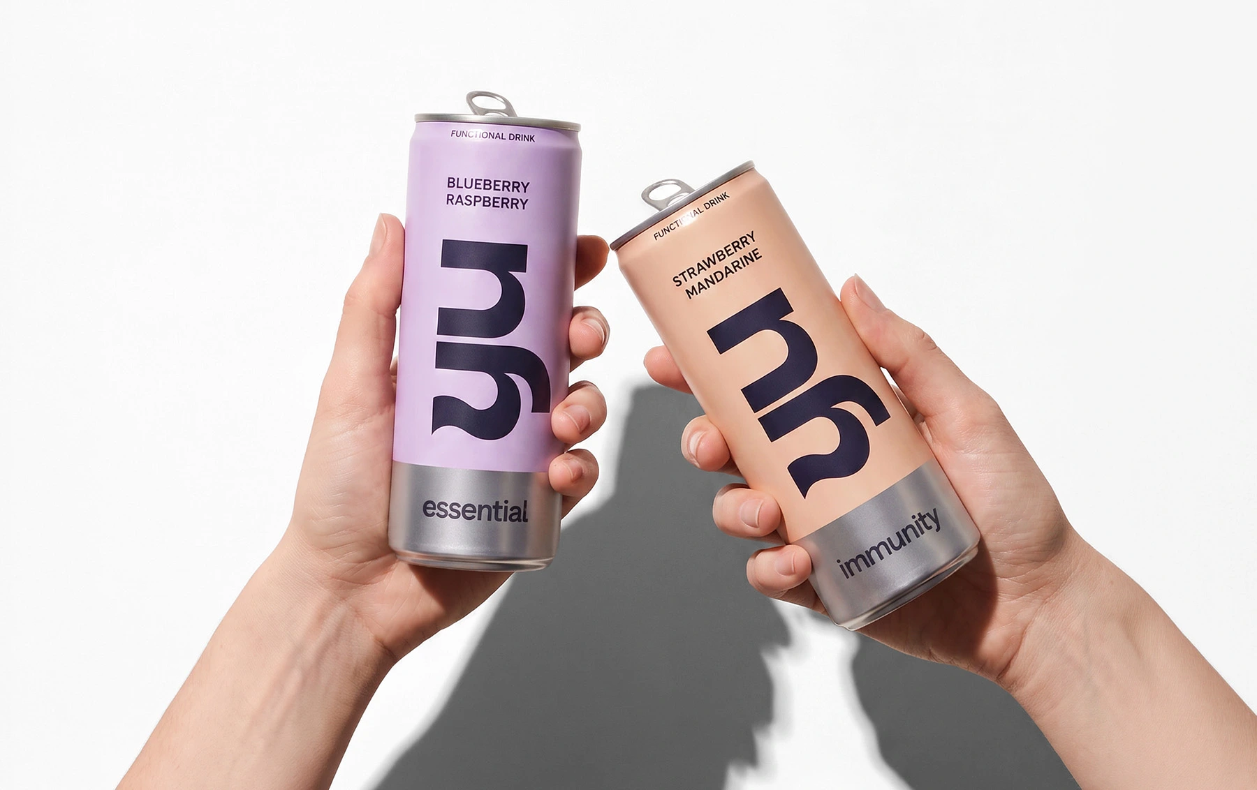
The logo is a solid, clear wordmark with personality. We built a tailored typographic form with one fluid detail on the terminal of the “y”. Subtle, but distinct. It isn’t decoration, it’s a controlled dose of character, enough to make the mark ownable without making it loud. YU doesn’t try to look like anyone else. It has a visual identity with its own typographic voice, and it doesn’t need to raise it.


Packaging design: it doesn’t try to be different. It is.
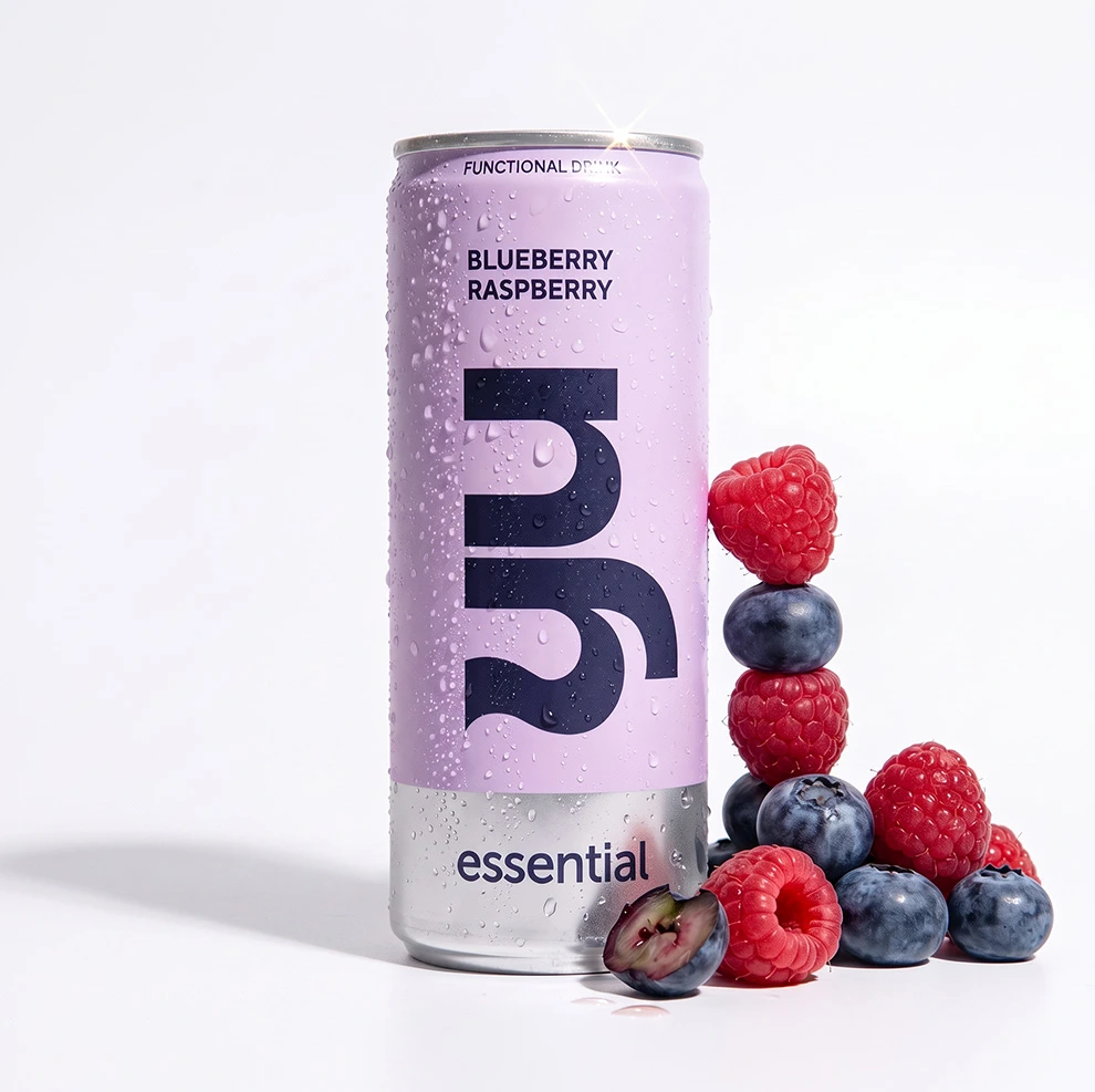
The packaging starts from one rule: form serves function, with intention and discipline. No graphic noise, no gratuitous wow. Negative space isn’t leftover layout. It’s a working tool that leaves room for the eye, for trust and for the decision.
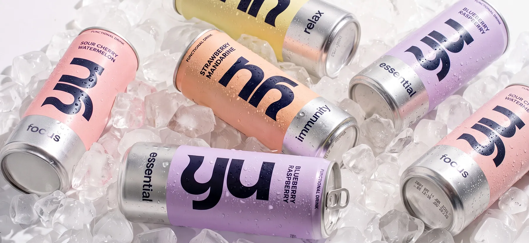
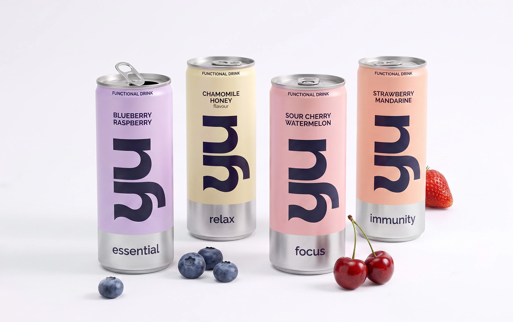
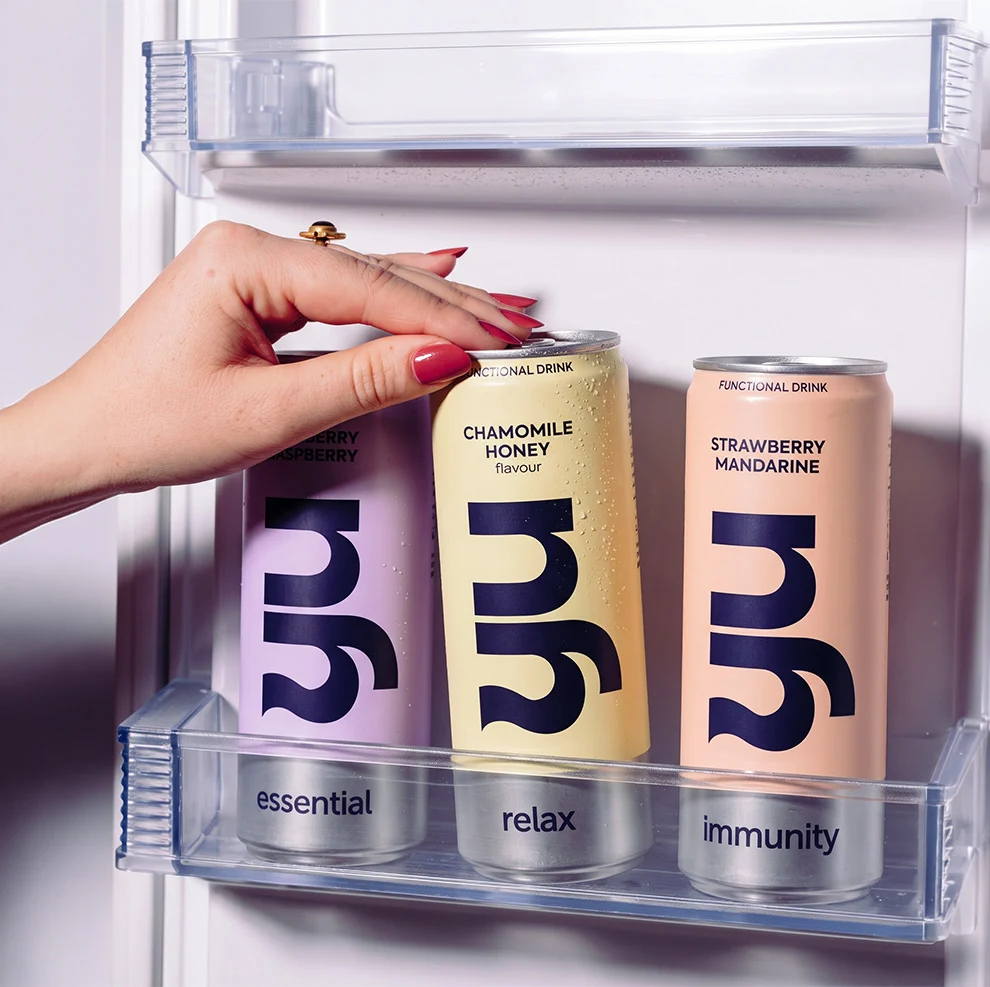
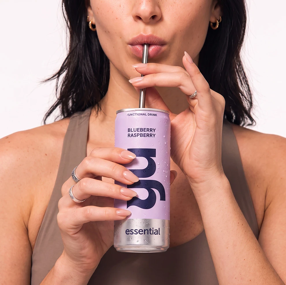
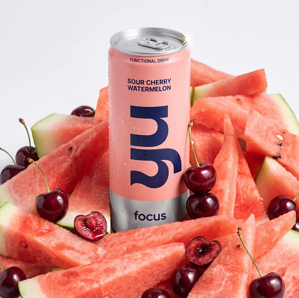
The YU wordmark anchors every can, legible and strong enough to carry the whole system. Each variant is signalled by a natural colour accent in soft, modern tones, chosen to complement rather than compete. Immunity, Relax, Focus and Essential read as one family, yet each is easy to find at shelf. The same system carries through to the PR box and the can tray, so the brand stays consistent from shelf to first unboxing. See how we approach packaging design.

The unprinted edge: raw aluminium as a decision
The detail people notice is the one we didn’t print. Part of the can is left as raw, exposed aluminium. It creates a natural contrast that guides the eye without overloading it. It isn’t an omission. It’s a choice, and it says the same thing as the formula: nothing added that doesn’t need to be there. On a shelf full of products with something to prove, YU looks like a product with something to offer.


From zero to hero!
“Together we created from scratch a product with a distinct, memorable visual identity. The project took much more work than we anticipated, but the result was worth it. BroHouse remains for us a dedicated team, with solid expertise, that does not back down from challenges. It is not easy to create a product with visual impact that at the same time maintains the direction of a minimalist design. Thanks, Bro! I hope to see you again on other projects!”