
Teriani is a premium European functional-mushroom brand built around a simple conviction: an ingredient with real provenance deserves a name and a design language that feel authored, not manufactured. This case study documents the strategy behind the winning name, the identity, and the packaging system that positions Teriani in a visual territory the category has left wide open.

Teriani
Services
Brand Strategy
Naming
Brand Positioning
Logo Design
Packaging Design
DTP
Teriani – Premium Mushroom Branding & Packaging
Everyone sells mushrooms. Nobody owns the shelf.
Functional mushrooms have become one of the fastest-growing categories in wellness and gourmet food — and with growth came sameness. Shelves and marketplaces fill up with earthy browns, clinical supplement cues, apothecary labels and interchangeable “adaptogen” design tropes. Most brands look either like a laboratory or like a health-store afterthought.
Teriani needed the opposite: a name and an identity that could signal genuine European provenance and artisanal quality, sit credibly between the kitchen and the wellness aisle, and – critically – own a distinctive visual territory no competitor had claimed. The brief was as much about differentiation as it was about desirability.
A name that tastes like where it comes from
Teriani never lies about its origins, it suggests European, artisanal quality without ever overclaiming. The name is engineered from two roots, each doing deliberate strategic work: Rooted in the Latin terra (earth, ground, origin ) TERI evokes a place that is defined, delimited and cultivated with intention. It ties the brand to nature, to soil, and to authentic cultivation: a territory, not a factory.
A fungal symbol with quiet confidence
The identity occupies a rare space in the functional-mushroom category: premium, clean and deeply natural, all at once. A symbol drawn from the fungal world pairs with an elegant, generously spaced wordmark to create a mark that is distinctive, memorable and instantly recognisable — a visual territory no European functional-mushroom competitor currently owns.
The detail that carries the strategy is the spacing. The generous letter-spacing across TERIANI communicates patience, quality and discreet premium — precisely the attributes of an author’s inWhite Space That Does the Heavy Liftinggredient. Nothing shouts; everything signals.

White space that does the heavy lifting
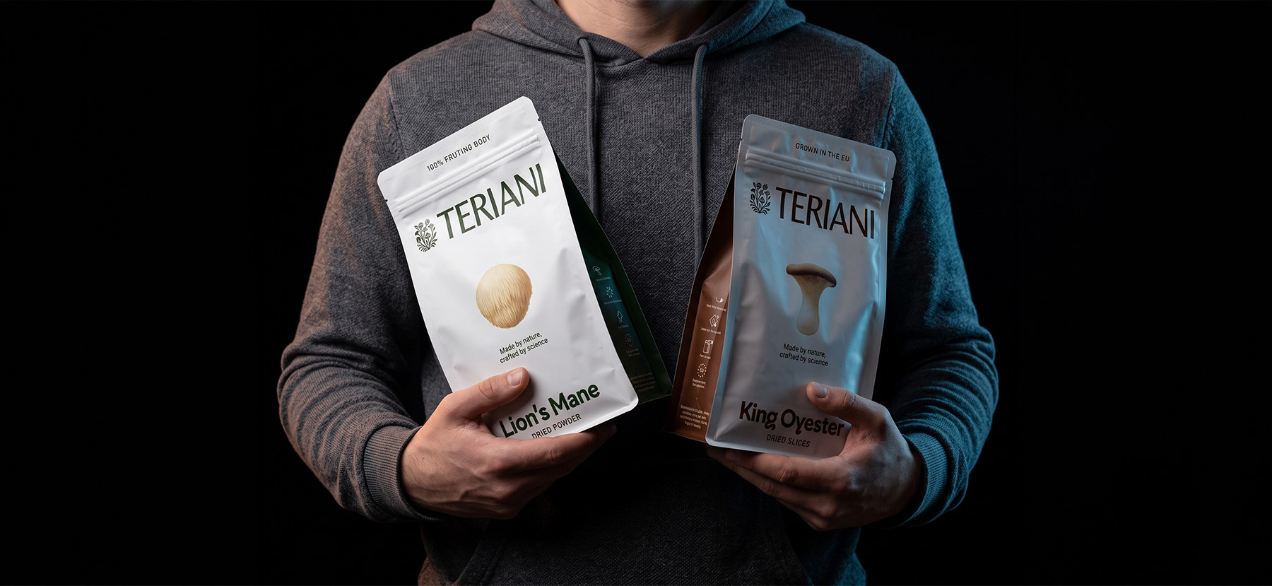
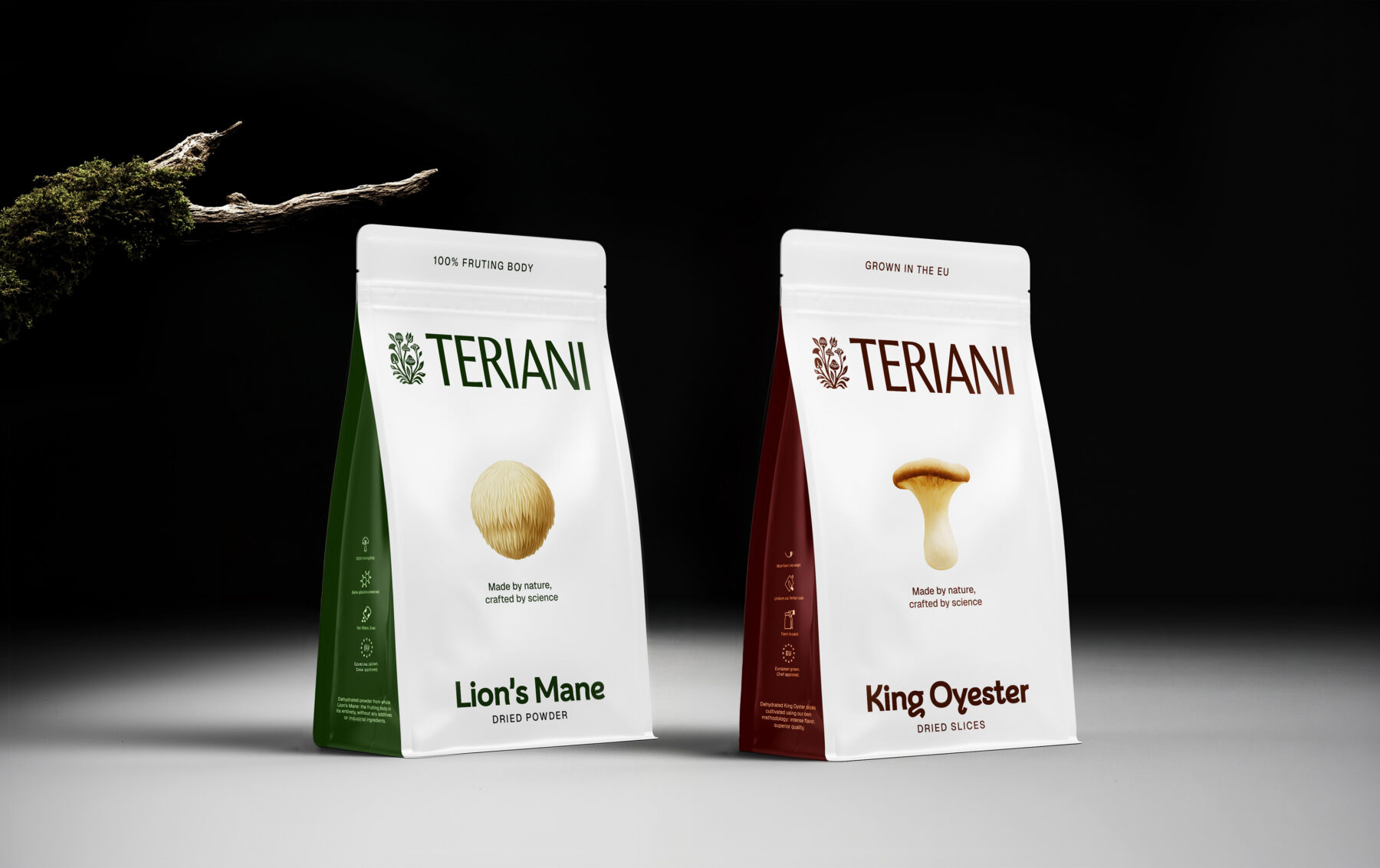
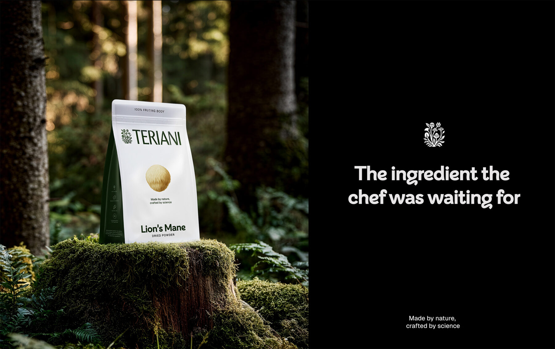
The packaging is a masterclass in restraint. A white field turns the product into the protagonist and differentiates Teriani instantly at shelf, while a generous, centred photograph of the mushroom transmits authenticity and confidence with no unnecessary visual tricks. A large, self-assured image is the visual language of brands that don’t need to overpromise.
Every element earns its place — from the competitive-advantage claims (“100% Fruiting Body”, “No Preservatives”, “Grown in the EU”) to the icon system down the spine. White does strategic work here too: it reads as quality, transparency and precision — the exact attributes tied to Teriani’s core differentiator.


Simple by design, deliberate by decision
Teriani activates an accessible aspiration: it invites people in rather than gatekeeping them out. The brand borrows the cultural equity of slow food and the ingredient-with-a-story, then delivers it with the calm confidence of a product that trusts itself. It doesn’t need to be the loudest thing on the shelf to be the most chosen.
