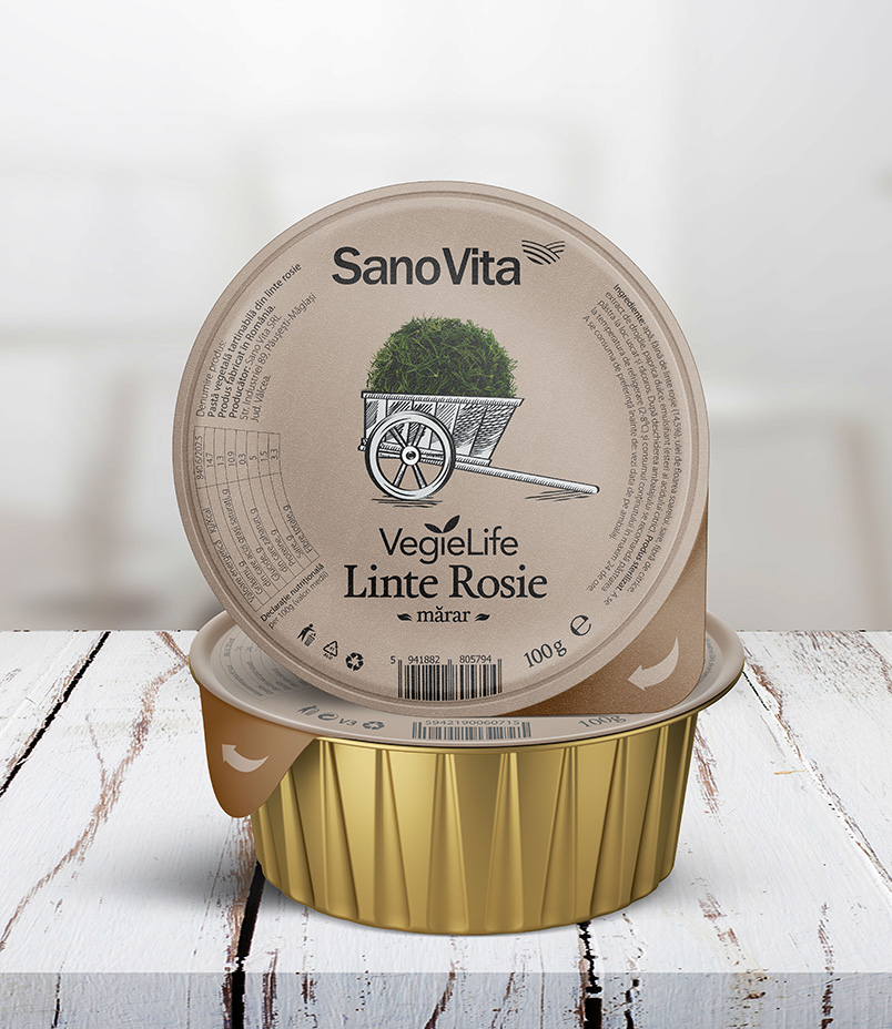
About 24 years ago, SanoVita committed to delivering healthy and high-quality products to the Romanian market. Recently, a new brand of vegetable pate called Vegie Life has been added to the SanoVita portfolio. It was a challenge to create a consistent and distinctive packaging design for the two pate ranges – Red Lentil and Bob Lentil – and to support the entire product portfolio.


Vegie Life
Sector
Healthy Food
Services
Brand Strategy
Brand Identity
Packaging Design
Marketing Materials
DTP
Vegie Life

The challenge is more beautiful when you have a good product
The challenge presented by SanoVita’s brief was not simply to create an aesthetically pleasing design, but to develop a flexible solution for a portfolio of four pates in each of the two product ranges: Red Lentil and Bob Lentil. The most difficult aspect of the project, and the key to its success, was finding a way to unify all the sub-categories of pates under a cohesive concept.
To achieve this goal, we created a graphic concept that was sufficiently adaptable to support the entire product portfolio for both ranges of vegetable pates: Red Lentil and Bob Lentil


Packaging design: It’s me, your product!
The packaging design must tell a story to sell – it is essentially an advertisement on the shelf. A pack in a supermarket has less than 3 seconds to capture the attention of potential consumers. That’s why BroHouse’s approach was to create a packaging design that would become a symbol in its own right.
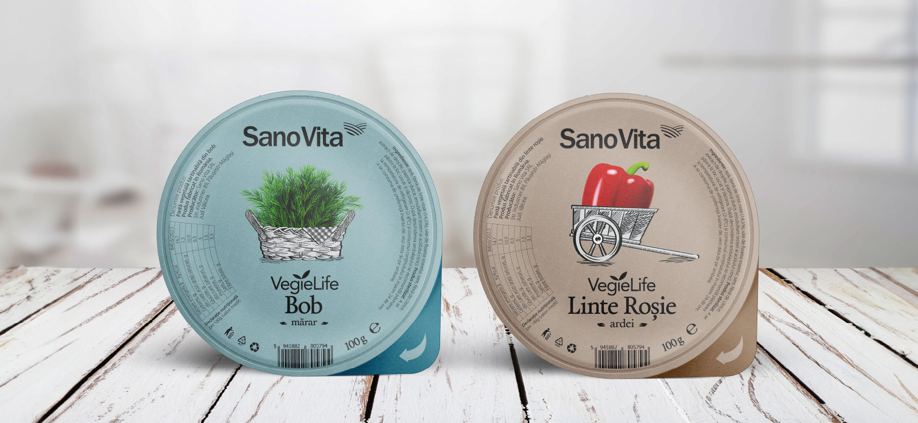
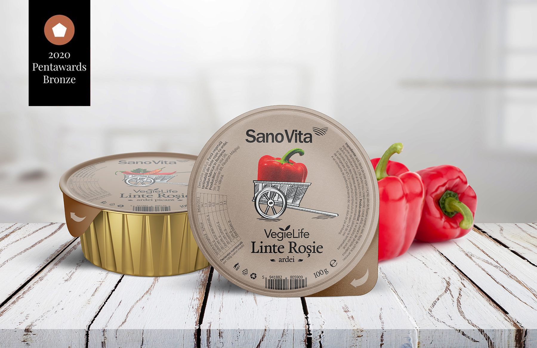
The master packaging concept was based on the idea of restoring the “tastes of old times” into a clean, natural, and healthy product – a promise that the SanoVita brand has upheld since 1995. The two illustrations used on the packaging – a pewter cart and a peasant carriage – were chosen to generate a rational impact that emphasizes the benefits of the two Vegie Life product ranges. We created a unique packaging design for each pate, while retaining the elements that identify the brand and offering differentiation within the portfolio and on the shelf.
Although each label has individual elements specific to the product, the packaging design remains consistent with the master packaging solution, ensuring that the Vegie Life brand is still recognizable and familiar.

Simplicity and good taste
Our aim was to create a packaging design that was simple, clean, and easy to understand, and that stood out from other products in the category through its elegance. We wanted to ensure that consumers could quickly and easily identify the Vegie Life brand on the shelf.
To achieve this goal, we opted for a simple and uncluttered design, rather than an extravagant or busy one. By keeping the design simple, we were able to make the packaging more visually striking and memorable, without sacrificing clarity or ease of use

Natural products, natural colors
Color plays an essential role in distinguishing between the two ranges of pates. We chose brown, the color of the earth, for the Red Lentil pate, and blue for the Bob pate. By using these two distinct colors, we were able to clearly communicate the difference between the two product ranges, making it easier for consumers to make a purchase decision and remember their choice

Bronze Trophy – Pentawards | International design awards
We are thrilled to announce that our packaging design solution has won a bronze award at the PENTAWARDS 2020, the most globally prestigious award for packaging design since 2007. With over 2,000 entries from 60 countries, we were recognized as the winners in the Food Trends category.
We are deeply honored and grateful for this recognition, and it inspires us to continue exceeding our own and our clients’ expectations. We would like to express our sincere gratitude to SanoVita for their incredible support and courage in bringing this project to life

Long-term results and other certainties:
- Increased visibility on the shelf.
- Flexible master packaging that allows the development of the brand into different categories.
- The articulation of the philosophy on which the SanoVita brand was built.
- Increased testing of the product for the “bio” audience segment.
- Packaging design relevant to the target consumer.
