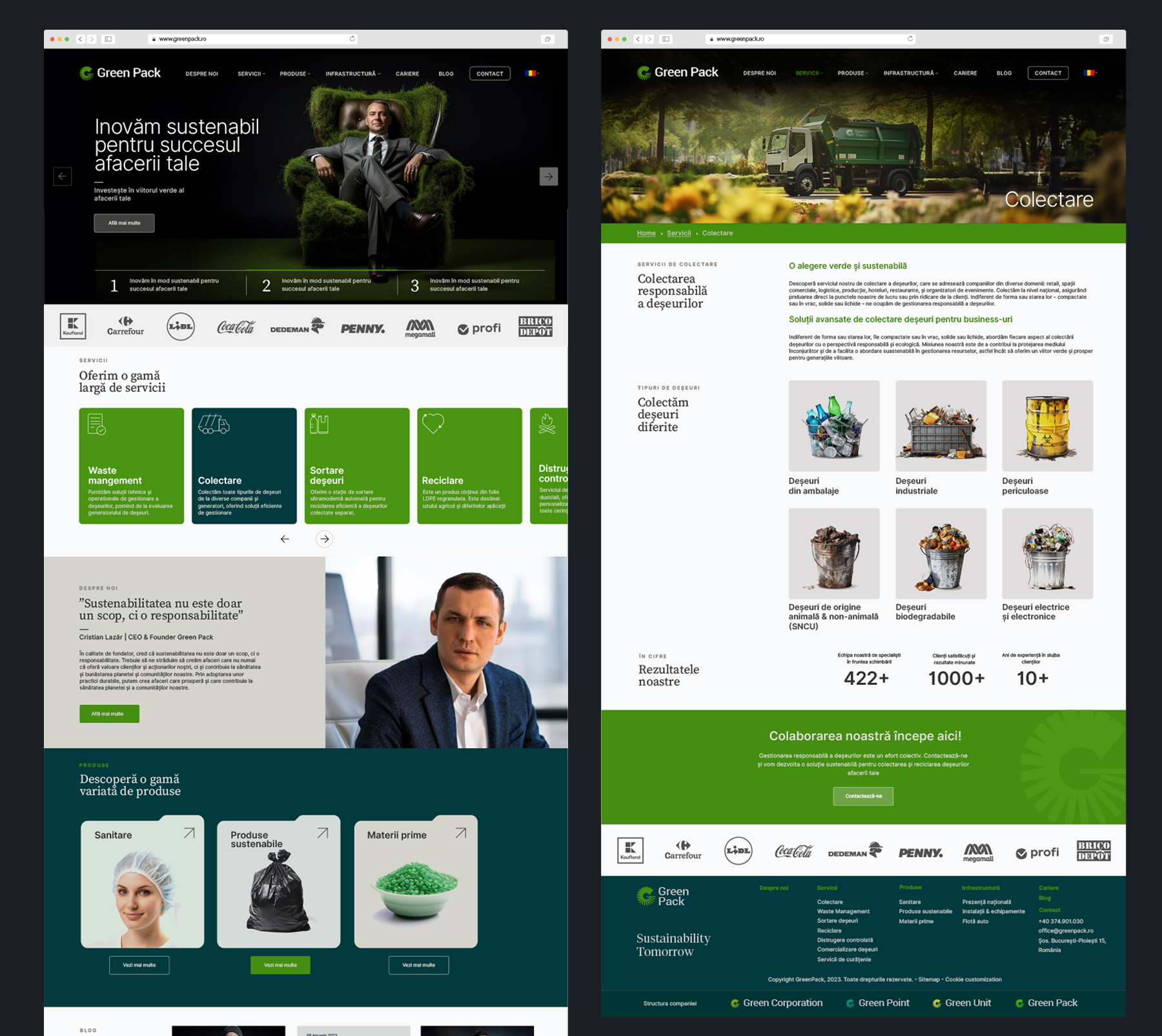
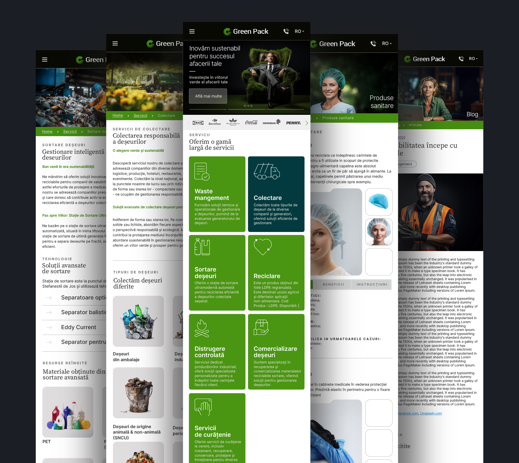
The rebranding strategy aimed to reflect the company’s values and vision, emphasizing their dedication to environmental sustainability and technological advancement. As a result of this rebranding effort, the three holding companies – Green Pack, Green Point, and Green Unit – received a new visual identity that reflects their shared purpose of minimizing their environmental footprint and creating a more sustainable future. The new master brand identity reflects a fresh, modern look while maintaining the company’s commitment to sustainable practices.
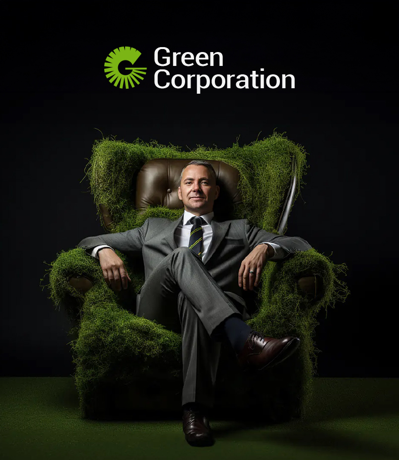

Green Corporation
Sector
Waste Management
Services
Rebranding
Brand Strategy
Brand Positioning
Logo Design
Naming
Brand Tagline
Design System
Web Design
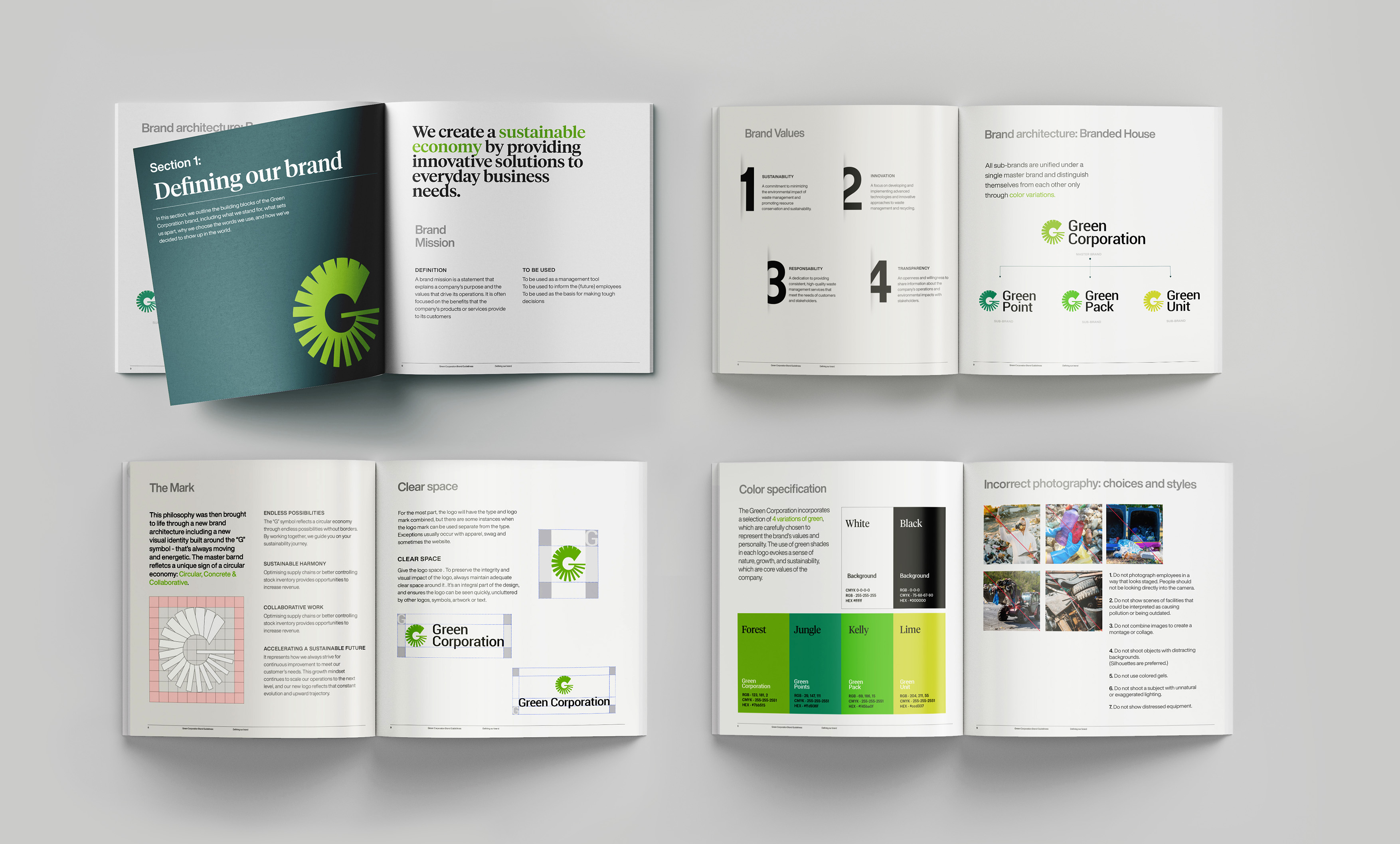
Brand Guidelines
Green Corporation
Building a more sustainable future for business and society
The new branding positioning of Green Corporation, ‘We create a sustainable economy by providing innovative solutions to everyday business needs,’ aligns perfectly with the company’s commitment to sustainability and innovation. Through their three holding companies, Green Corporation aims to provide innovative solutions to businesses that prioritize environmental sustainability and social responsibility.
The rebranding efforts by BroHouse team have helped Green Corporation to communicate their core values and purpose to their stakeholders, including their customers, employees, and investors. The new brand identity reflects the company’s forward-thinking approach to sustainability and innovation and emphasizes their commitment to creating a more sustainable future for all.
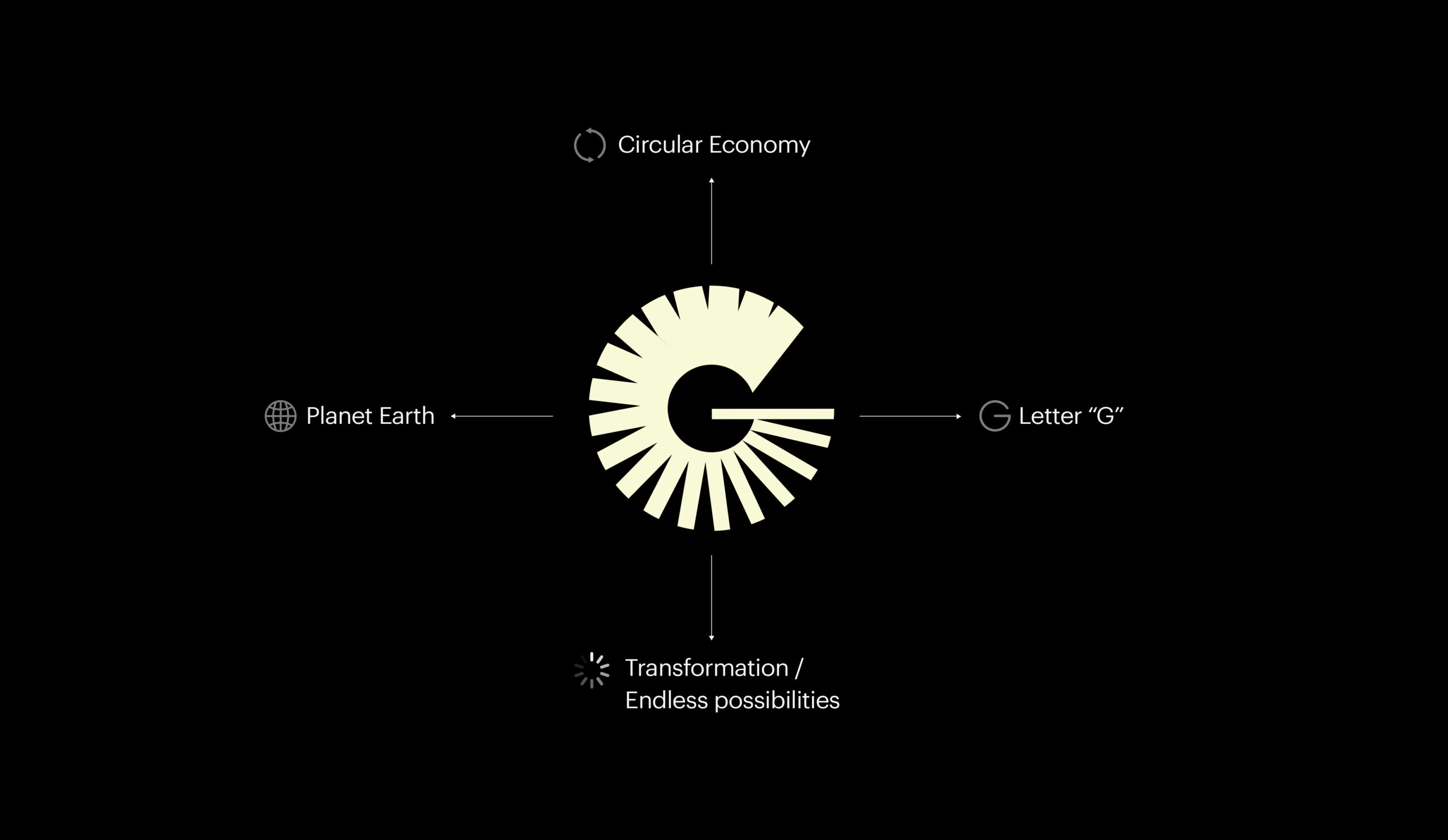
The Powerful “G” mark
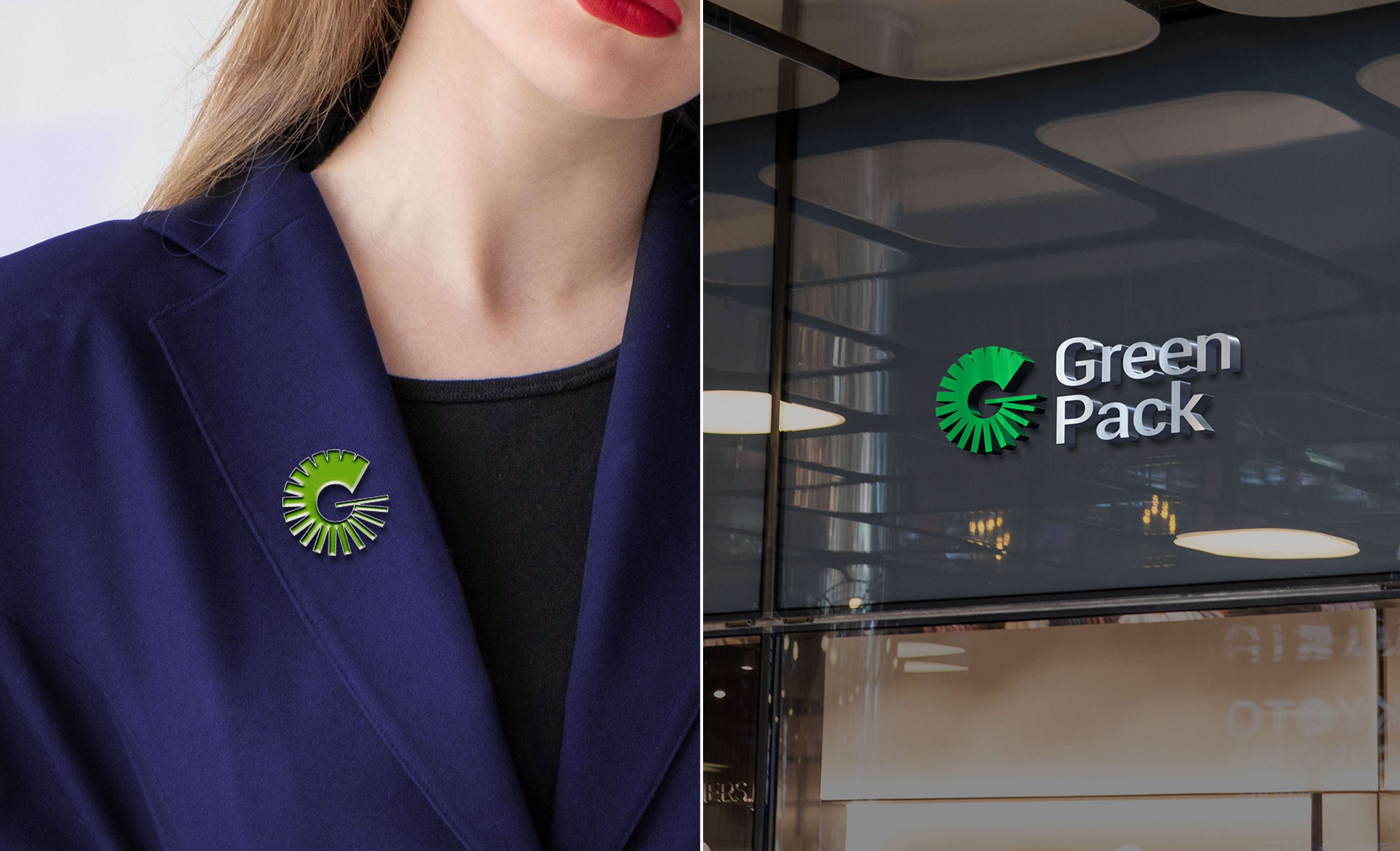
After the philosophy was developed, it was manifested through a fresh brand architecture, which involved creating a new visual identity centered on the “G” symbol – a dynamic and lively symbol that conveys constant motion. The master brand refletcs a unique sign of a circular economy: Circular, Concrete & Collaborative.
- Endless possibilities
The “G” symbol reflects a circular economy through endless possibilities without borders. By working together, we guide you on your sustainability journey. - Sustainable harmony
The logo has a sense of rhythm and balance achieved through the use of harmonious color palettes and balanced design elements, such as symmetrical shapes and proportions. - Collaborative work
The Green Corporation logo represents unity and teamwork, highlighting the importance of collaborative work in achieving sustainable development. - Accelerating a sustainable future
It represents how we always strive for continuous improvement to meet our customer’s needs. This growth mindset continues to scale our operations to the next level, and our new logo reflects that constant evolution and upward trajectory.
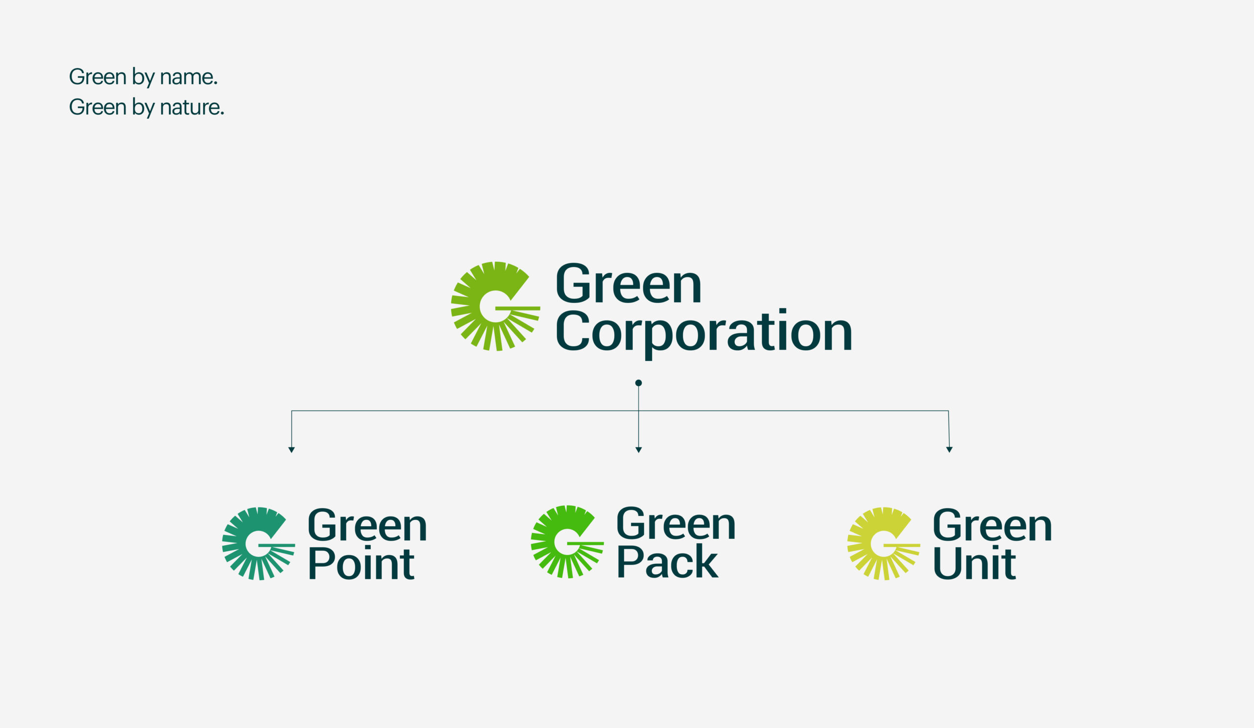
A single vision for sustainability: Green Pack, Green Point, and Green Unit under one umbrella
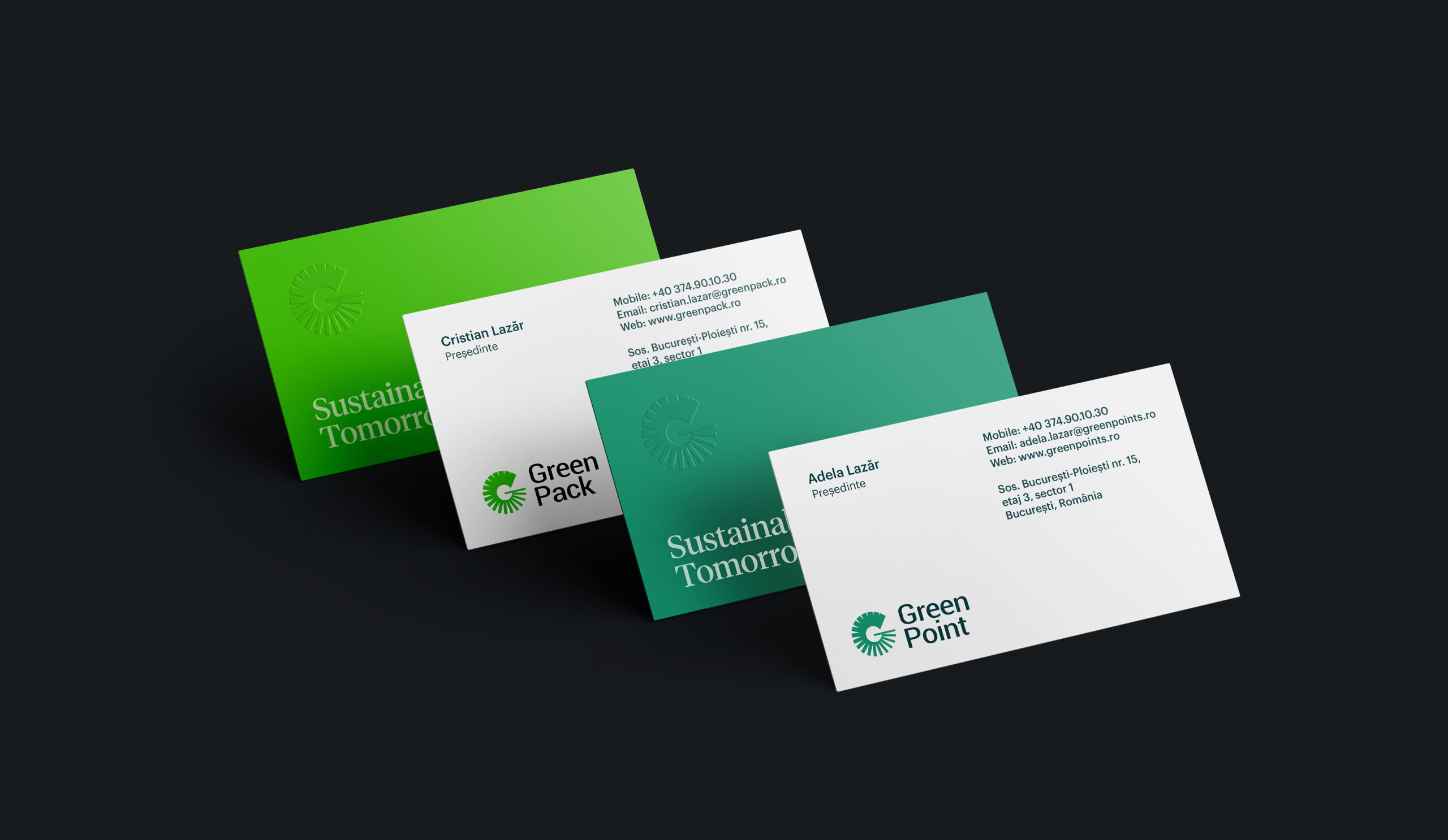
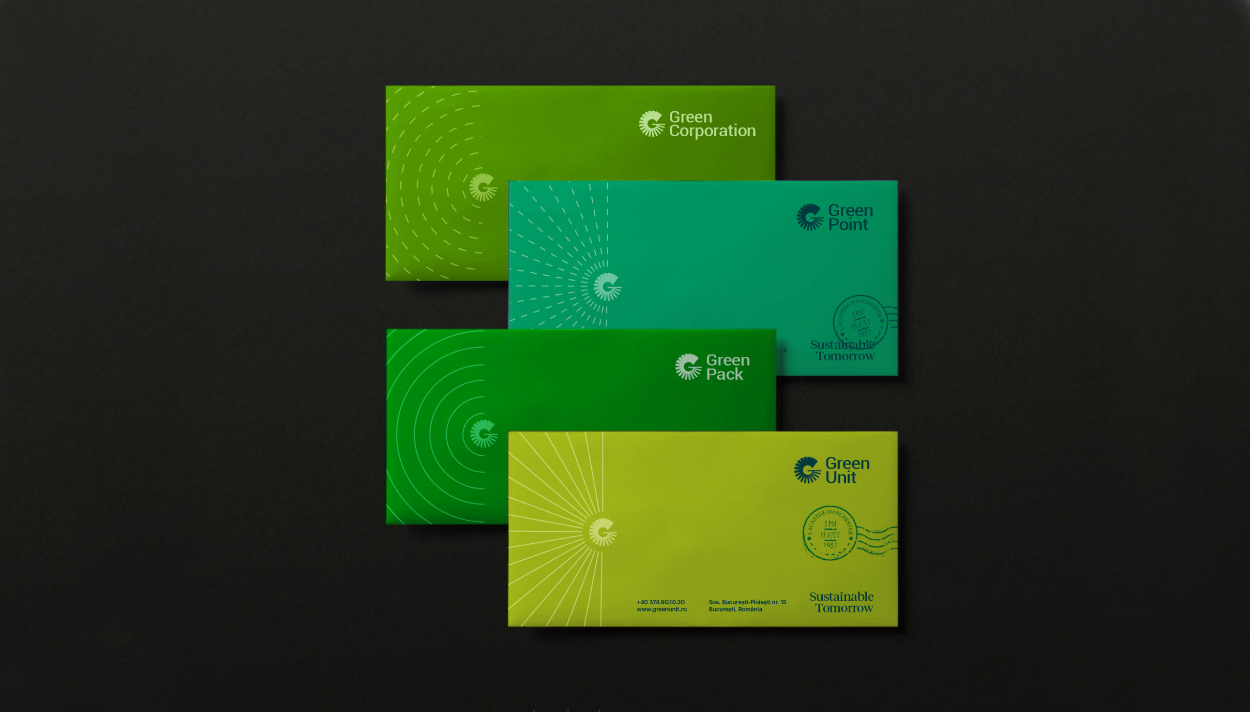
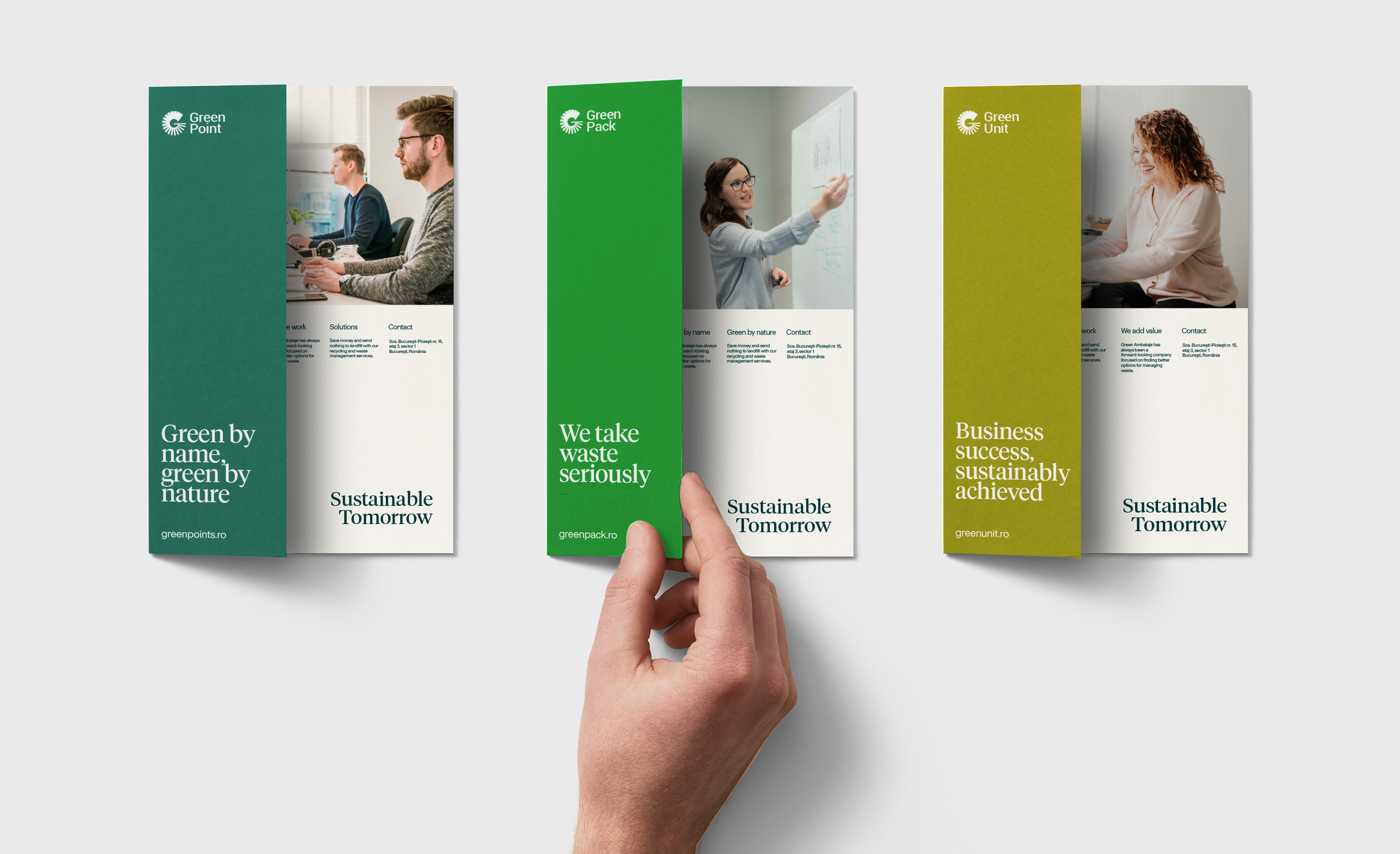
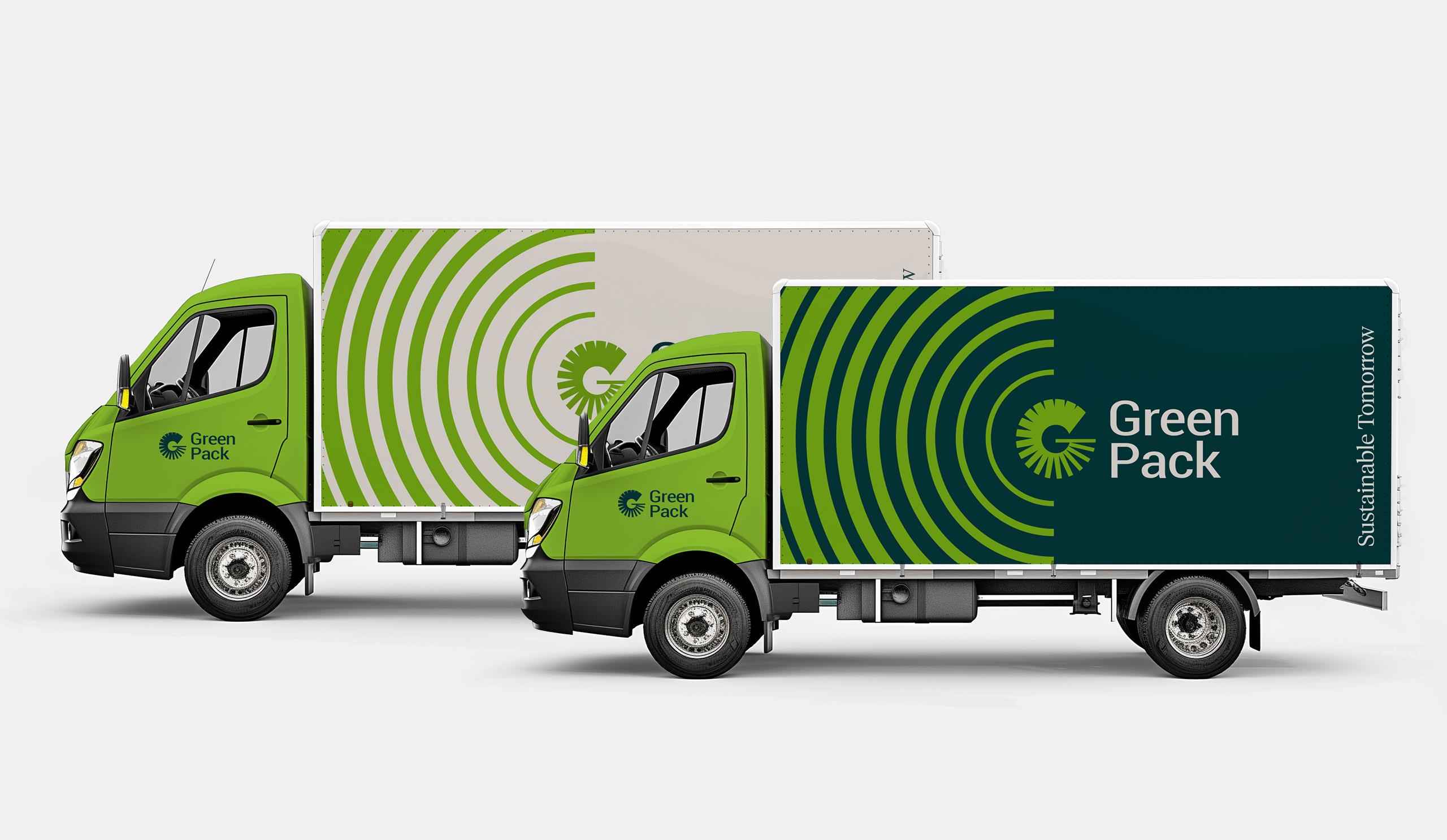
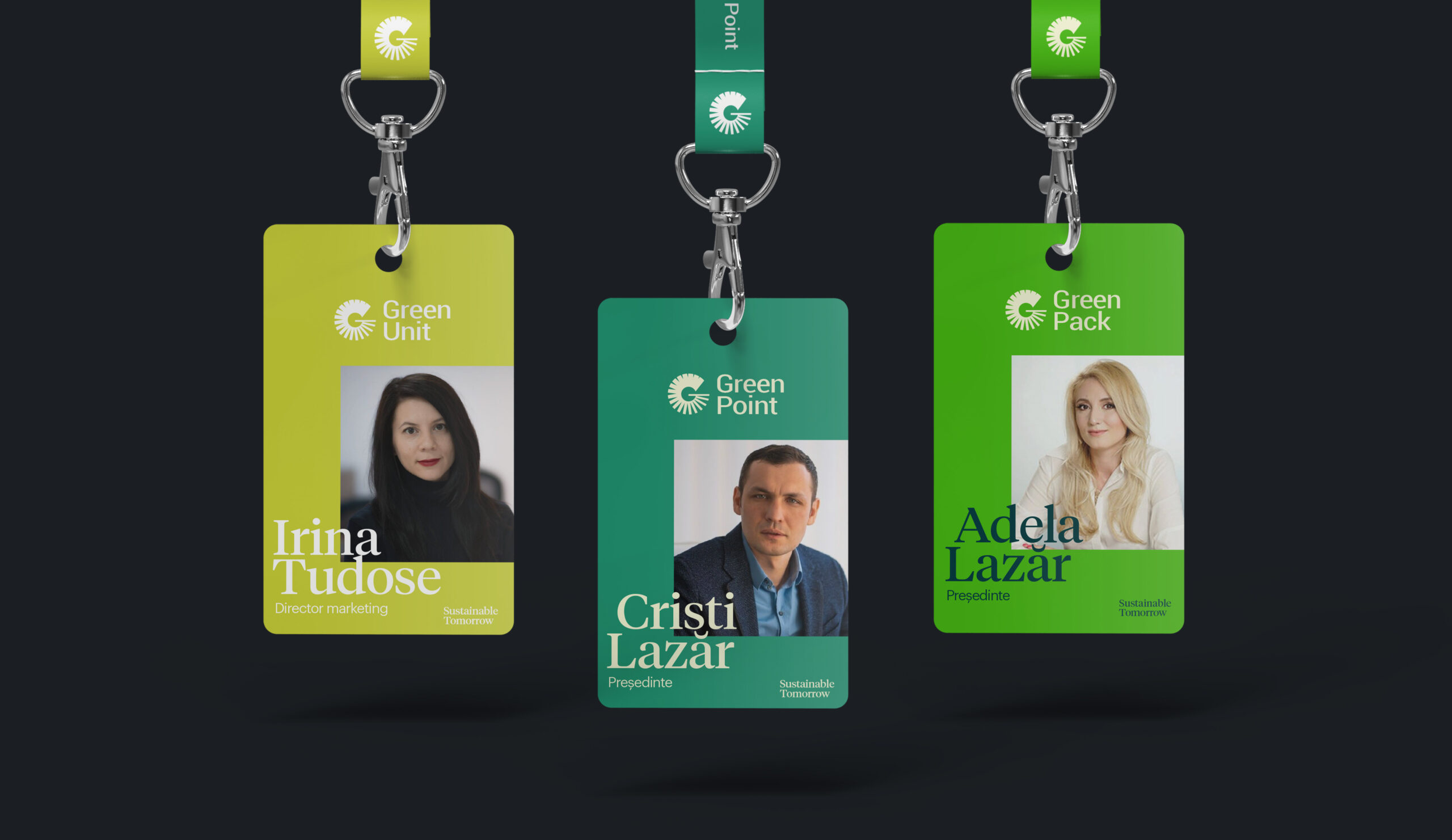
Green Pack, Green Point, and Green Unit are now unified under a single master brand, they maintain their unique identities through subtle color variations. The new branding strategy allows for greater recognition of each sub-brand while still maintaining the overall identity of Green Corporation. By leveraging a consistent visual identity across all sub-brands, Green Corporation can reinforce their values and messaging of sustainability and innovation, while ensuring that each sub-brand is easily recognizable and distinguished in the marketplace.
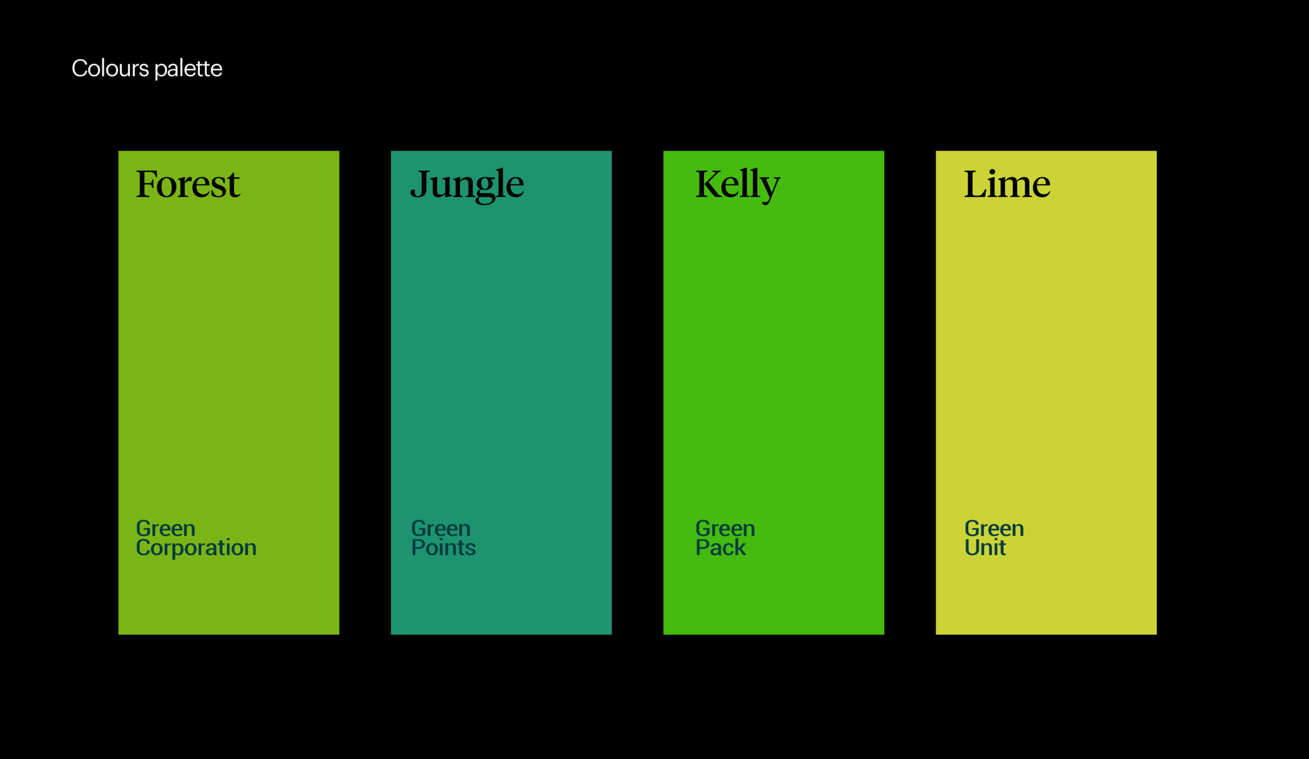
Green by name. Green by nature
The Green Corporation incorporates a selection of 4 variations of green, which are carefully chosen to represent the brand’s values and personality. The use of green shades in each logo evokes a sense of nature, growth, and sustainability, which are core values of the company. In some instances, the logo is designed to stand out on non-colors such as black and white, making it versatile and easily adaptable to various branding applications.
Sustainable Tomorrow
We helped shape a new promise for the Green Corporation brand: “Sustainable Tomorrow”. It positions the organisation as a brand that enriches people’s lives, it guides the business to act differently, and it invites employees to pursue their goals. And most importantly, it makes it imperative for Green Corporation to become an encouraging partner for all of its customers.

Introducing our innovative echo frame
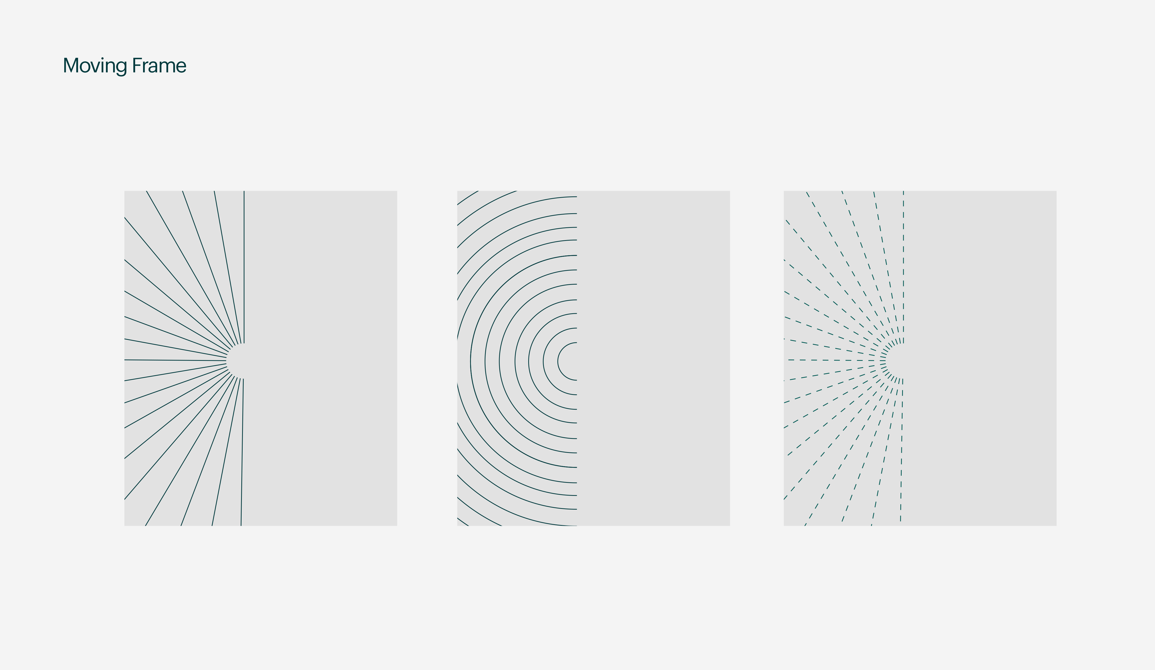
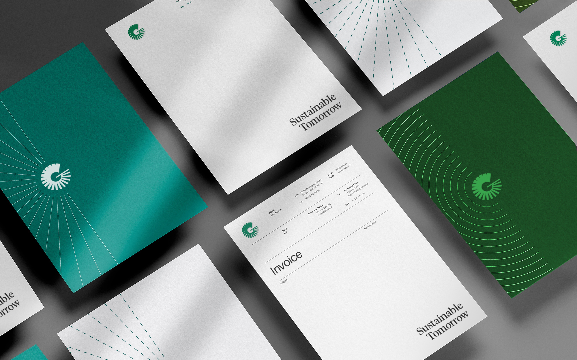
Our circular logo has inspired us to design an echo frame that adds a touch of elegance to our stationery. This moving frame features a stylish circular design that complements our logo and can be easily integrated into a variety of designs. By incorporating the echo frame into our stationery, it creates a unique and distinctive look that sets us apart.
Keeping the brand on track
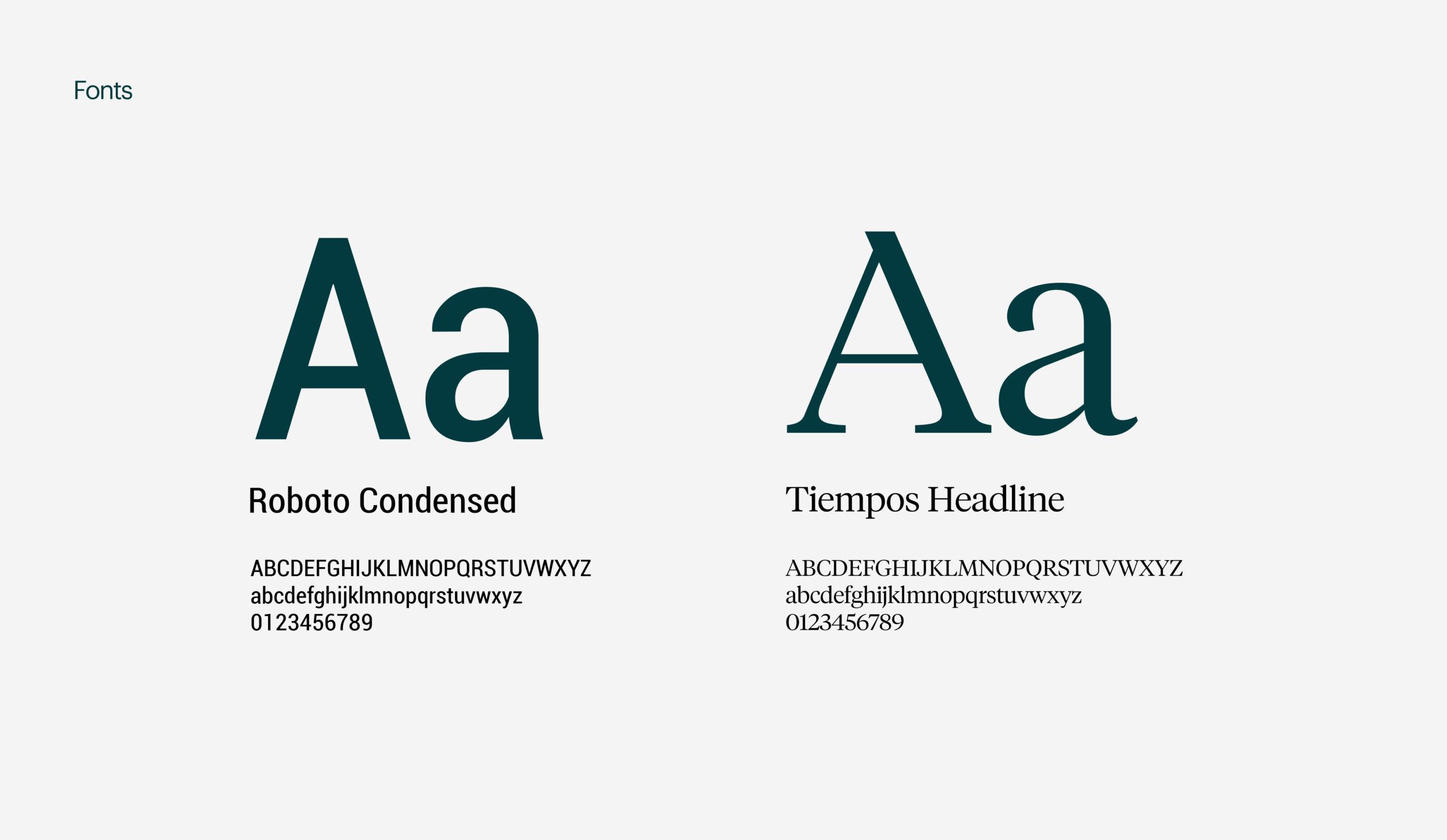
We developed a comprehensive brand guidelines document for Green Corporation. This document outlines the proper use of our master logo, color palette, typography, and other design elements. By following these guidelines, they can maintain a consistent brand image and effectively communicate their values and messaging to our audience.
