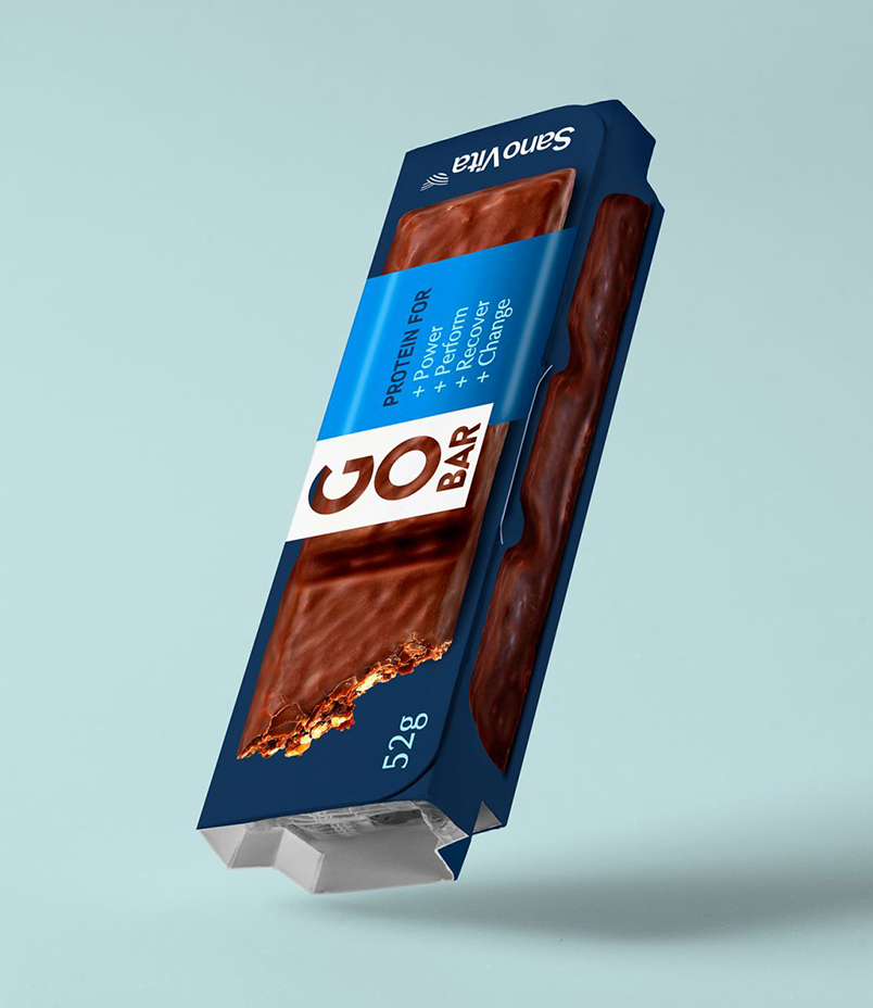
The producer SanoVita has launched its first-ever protein bar called Go Bar, positioned as a healthy snack suitable for those leading an active lifestyle. It offers long-lasting energy, bridging the gap between meals, and is enriched with functional compounds. Additionally, it serves as a source of dietary fiber and natural antioxidants. This product is now available in the German market, which boasts the largest organic food market in the EU. The challenge presented to SanoVita was the creation of a packaging design that not only piques consumer curiosity but also stands out in a market saturated with sugary and artificially colored products.
Go Bar
Sector
Vegan Bistro
Services
Brand Strategy
Logo Design
Packaging Design
Product Photography
DTP
Go Bar

Baptism Name: Go Bar
The name of the brand “Go Bar” is the main communication interface between the product and future customers. The name GoBar undoubtedly stands out and makes the brand unique and different from the competing brands. Being a new product, it was extremely important that the name of the protein bar be short, vibration, recognizable and to offer a potential for communication with future customers.
The wordmark is constructed from 2 words: “Go” and “Bar”. The word “Go” is a short one, with an international understanding that transcends geography and cultural barriers. It is the verb “locomotive” which denotes the essential functional characteristics of the product: energy and active life. The second word, “Bar”, is just one adjuvant that identifies the category of which it belongs: food supplements. It has an important secondary degree in product communication.
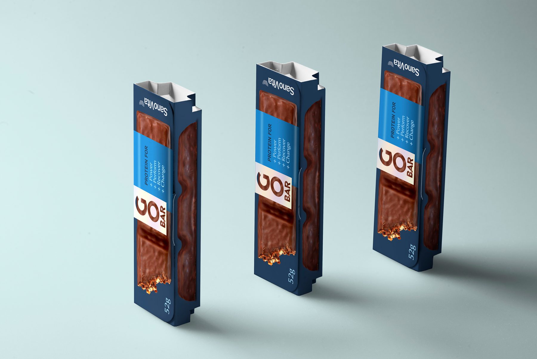
A symbol ready for action
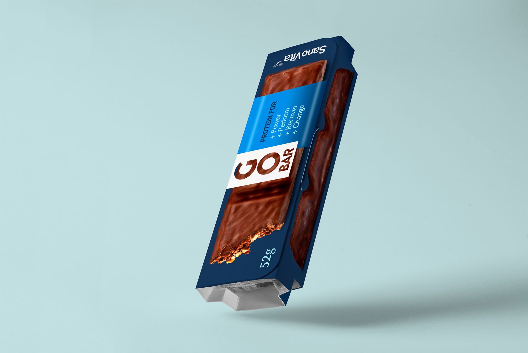
The creative solution is graphically dominated by the very name of the product “Go Bar”. The word “Go” is more scaled, disproportionately to the word “Bar”, in order to pay more attention. It is a word that is worth highlighting because it is the center of all values: energy, vitality, life, performance, and sport. It is the word that identifies the target audience: athletes, movement lovers, and healthy eating.
We choose a simple font without serifs, geometric, thick, yet bold font without serifs, integrated into a white rectangle, to create contrast with the rest of the elements that create the Go Bar stick label design.
The almost central logo-text placement in the packaging design represents a call for purchase, obtaining most of the attention of the graphic solution.
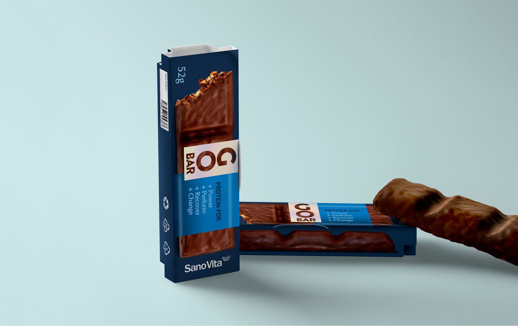
Packaging design: a window open to the product
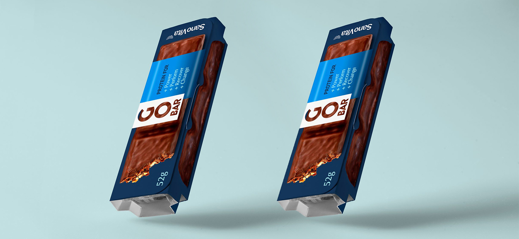
The photo of the protein stick can be founded in the real dimensions and occupies the entire surface of the label. The placement of the product in the label design is a declaration of sincerity and transparency towards the consumer: what you see is as true as possible. The solution also shows the essential features and benefits of the GoBar brand, which is a piece of very important information for the consumer.
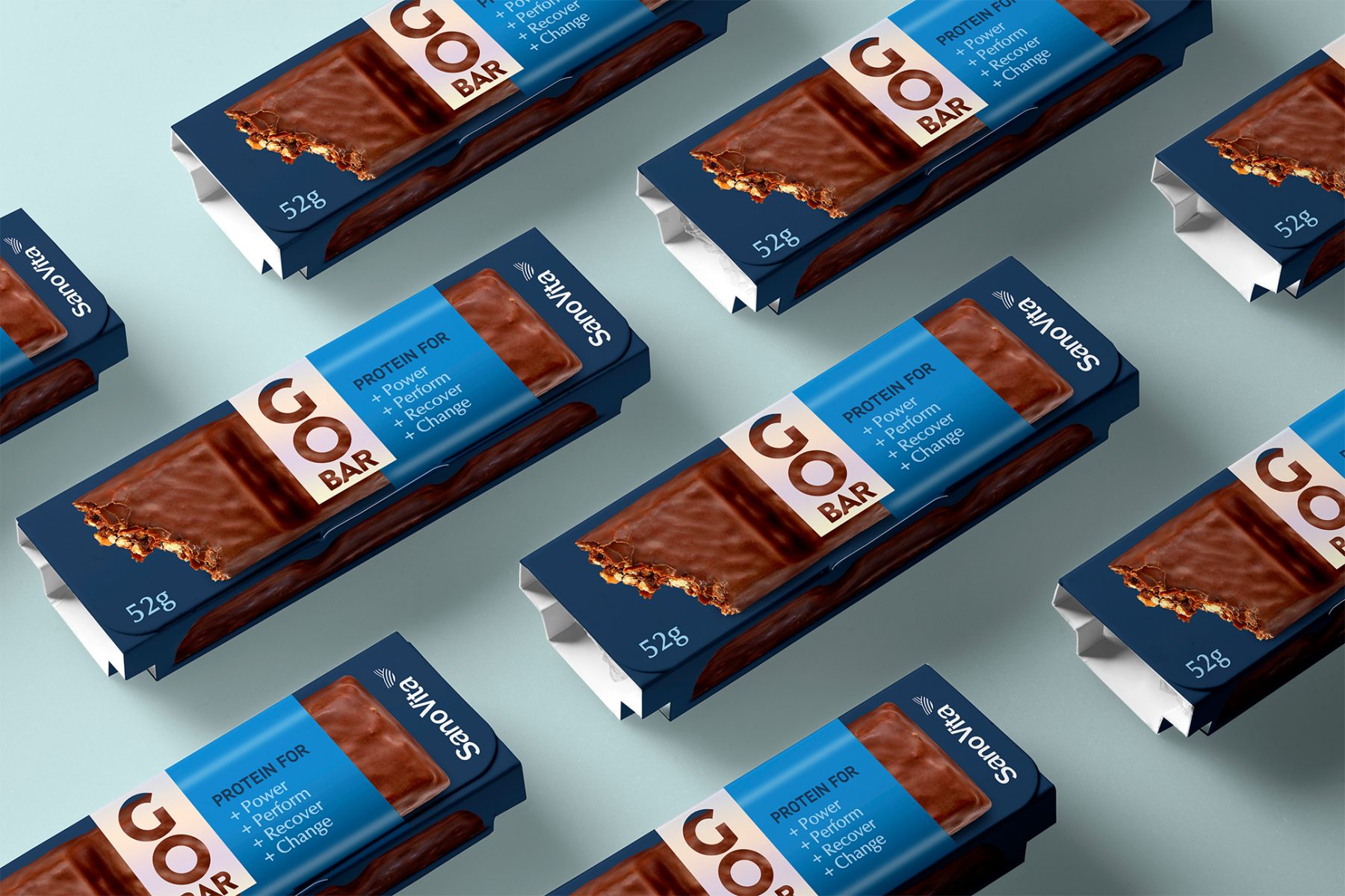
Our SanoVita Journey
Our voyage alongside SanoVita has been nothing short of extraordinary, characterized by triumphs in the realm of packaging design. Throughout our partnership, we embarked on 2 distinct projects: the creation of Vegie Life and the development of Puffed grain cakes. Each of these endeavors presented us with a unique set of challenges and opportunities, propelling us to stretch the boundaries of our creative prowess.
Our partnership with SanoVita stands as a shining testament to the sheer power of collaboration, creativity, and unwavering dedication. It’s more than a collaboration; it’s a journey of transformation and shared success.”

Long-term results and other certainties:
- Increased visibility on the shelf.
- Increased product testing for a new audience.
- The graphic solution flexibility allows the extension of the Go Bar brand into various sub-categories.
- A relevant name which reflects the position of the product in the given category.
- Identity and packaging design relevant for target customers.
