
The domestic manufacturer SanoVita intends to launch its own network of stores with products from its portfolio and other carefully selected products. 2 major components underlie this challenge, 2 services that offered a sense of purpose, mission, and direction. And these are: brand name and brand identity. We’ve encountered SanoVita in various projects, such as vegetable pate called VegieLife or GoBar protein bars, which has helped us gain a better understanding of the challenge.
Naturi | Sanovita
Sector
Healthy Store
Services
Brand Strategy
Brand Positioning
Brand Messaging
Naming
Logo Design
Marketing Materials
Naturi (SanoVita) – Retail Brand Identity
A brand name inspired by nature
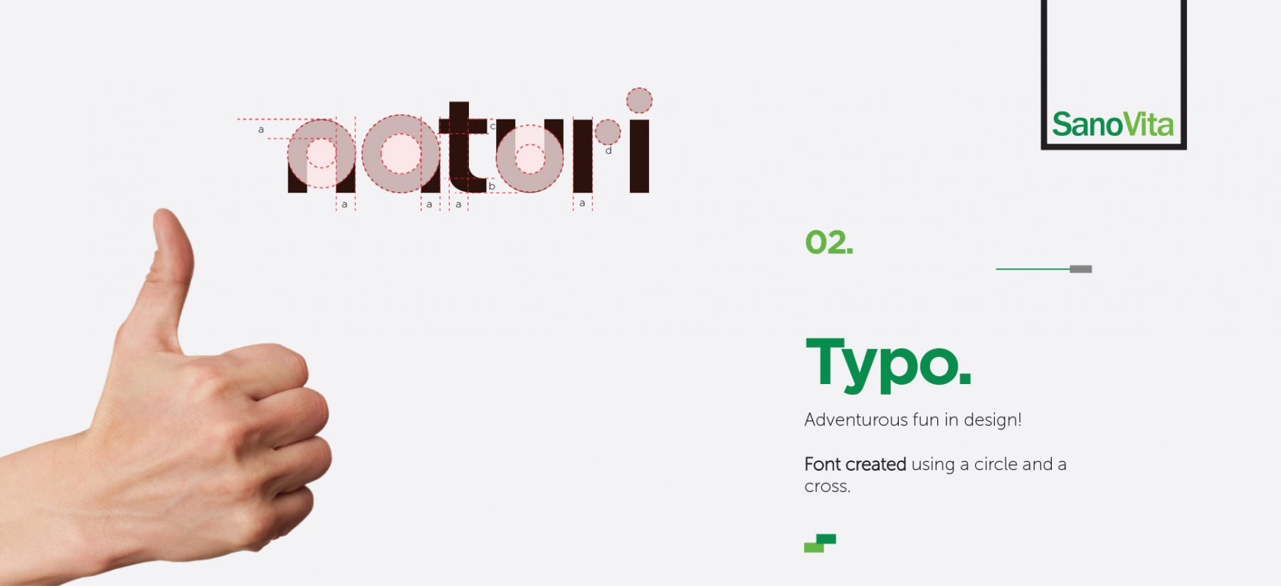
Since the beginning of the process of finding the name, we wanted to build a brand that can bring people together. The name “Naturi”, very clearly communicates the market niche of which it wants to belong, and a desire to negotiate for quality and selectivity.
“Naturi” is a short and easy to understand the name for most people who convey a clear definition of what Naturi brand is. A secondary purpose for finding the name was to maintain the meaning and objectives of the SanoVita brand and even to strengthen the parent brand.
As we embark on this journey with the “Naturi” brand, we are not just creating a product; we are nurturing a community of individuals who share our passion for health, quality, and authenticity. “Naturi” is a name that speaks to those who seek products that are not only good for them but also good for the planet.
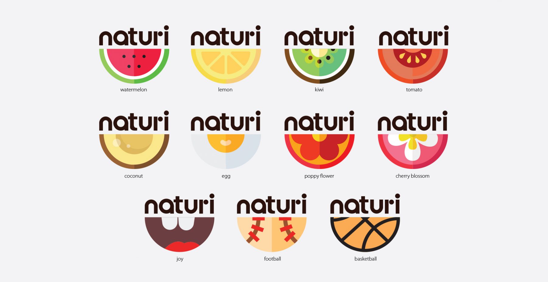
A logo in a continuous changing. Just like you.
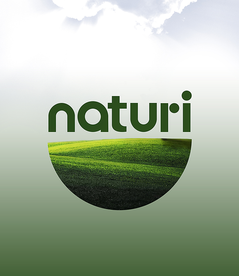
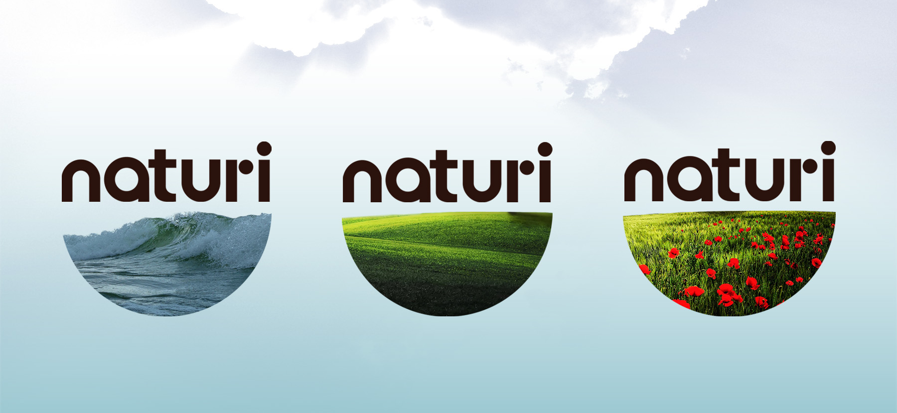
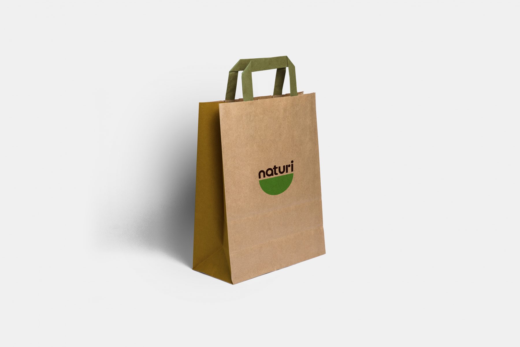
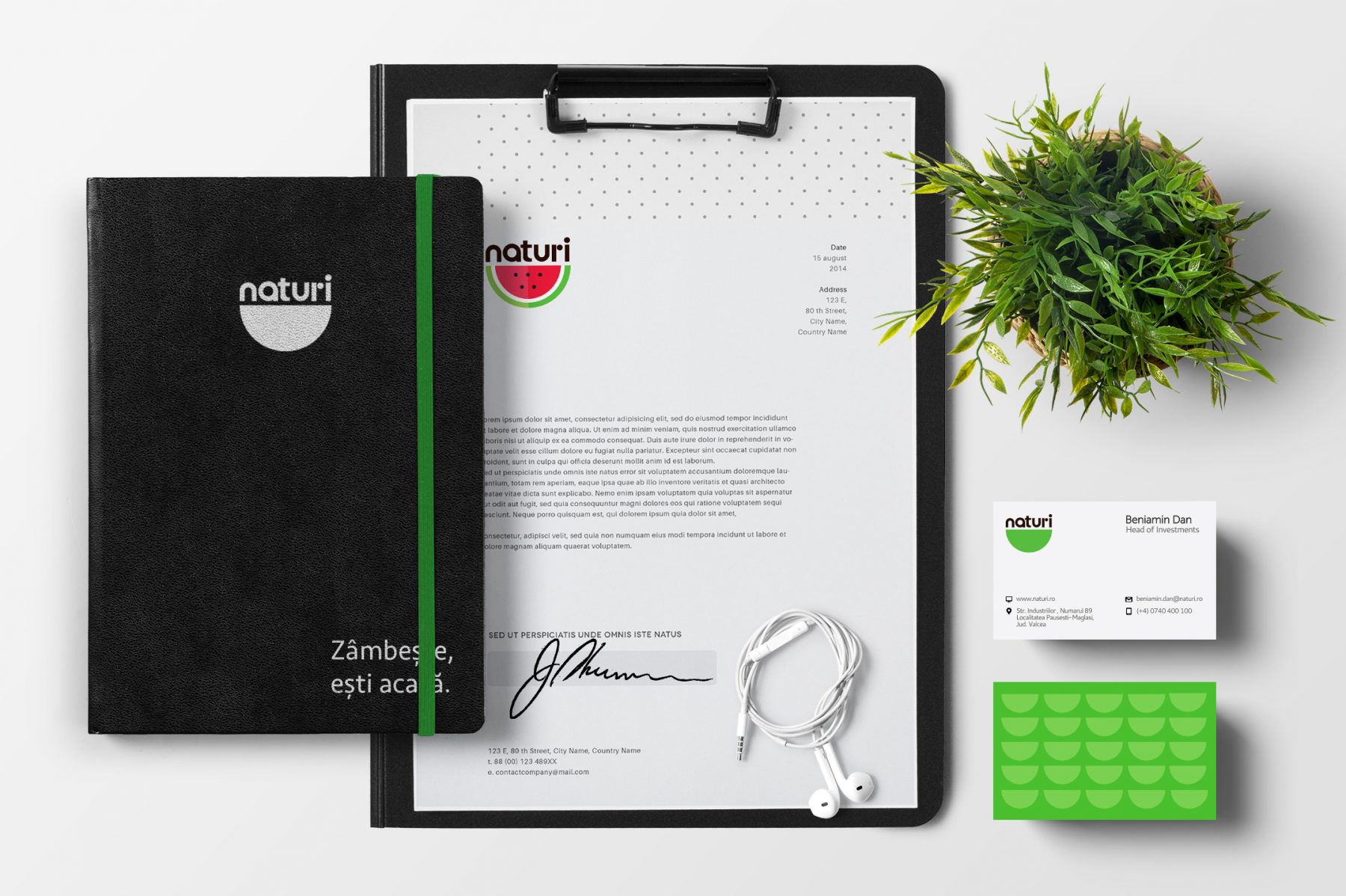
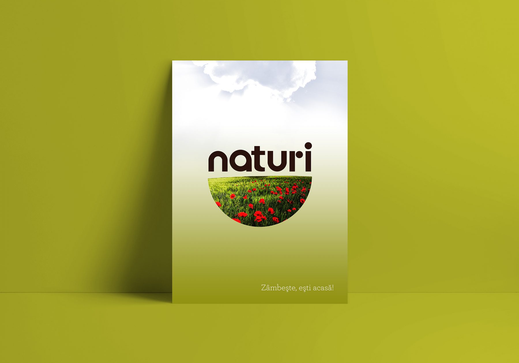
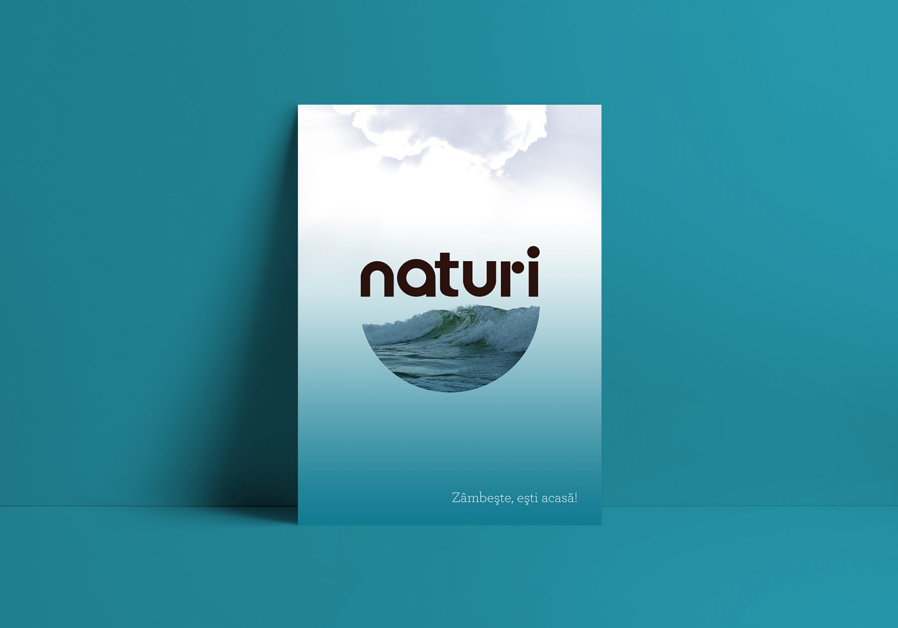
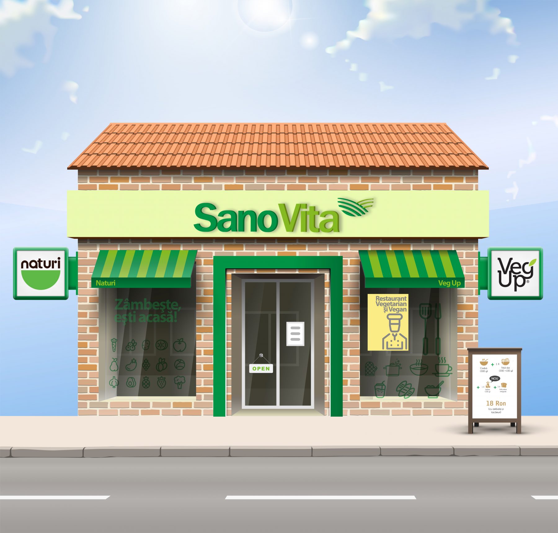
The “Naturi” project offers a constantly changing content, and the increasingly diverse technologies available today have created more and more communication opportunities. For this reason, we have chosen a dynamic and flexible logo solution that can capture the entire spectrum of offers, specific messages but also a variety of applications.
This solution allowed us to provide additional information and pay attention to details of interest to the target audience. We managed to transform a static and lifeless symbol into a point of contact and interaction with the consumer. With this dynamic solution, context (not content) is king.
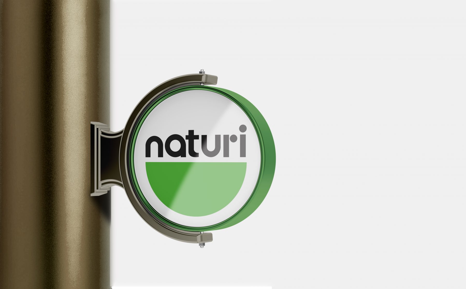
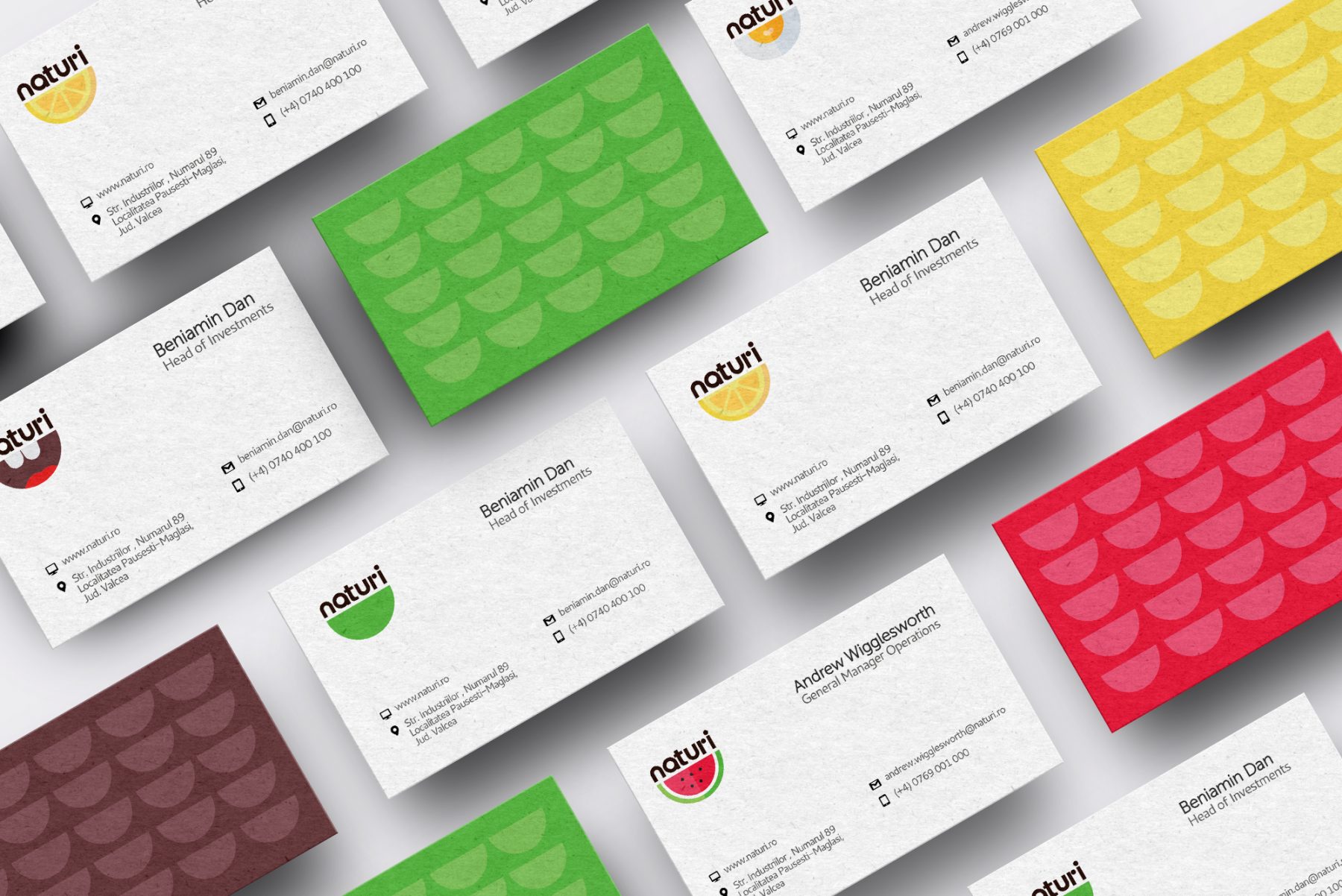
The “Naturi” project presents an ever-changing landscape of content, and the rapidly evolving technologies available today have opened up a plethora of communication opportunities. This is why we have chosen a dynamic and flexible logo solution that can encompass the entire spectrum of offerings, convey specific messages, and adapt to various applications.
This approach has enabled us to provide additional information and focus on details that matter to our target audience. We’ve successfully transformed a static and lifeless symbol into a point of contact and interaction with consumers. With this dynamic solution, it becomes clear that context, rather than content, takes precedence. In essence, our dynamic logo is more than just a symbol; it’s a reflection of SanoVita’s ethos—a commitment to keeping our audience engaged and informed by adapting to the ever-changing dynamics of the “Naturi” project and the modern communication landscape.
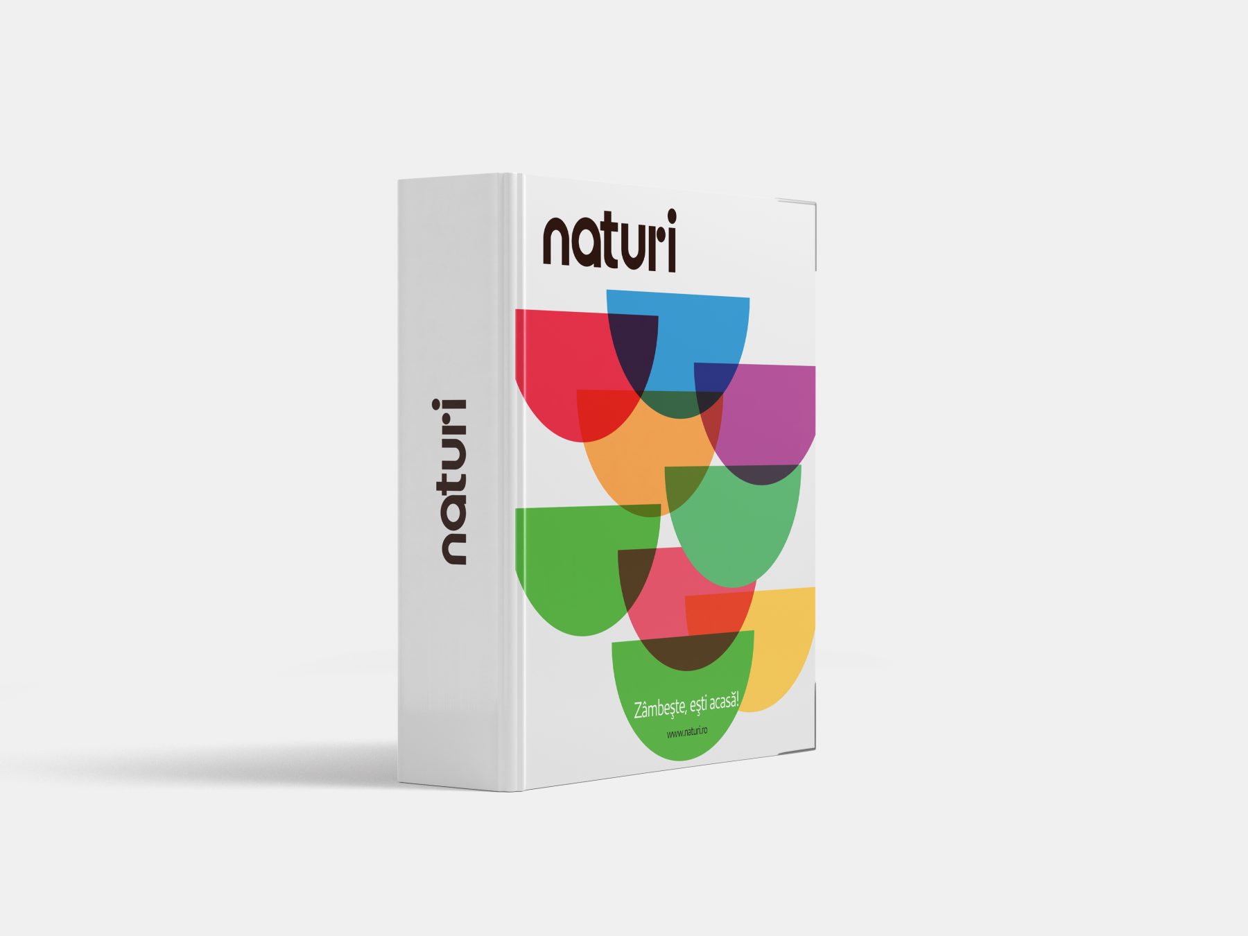
Meaning of the green color
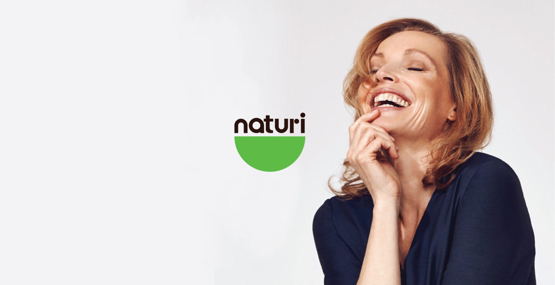
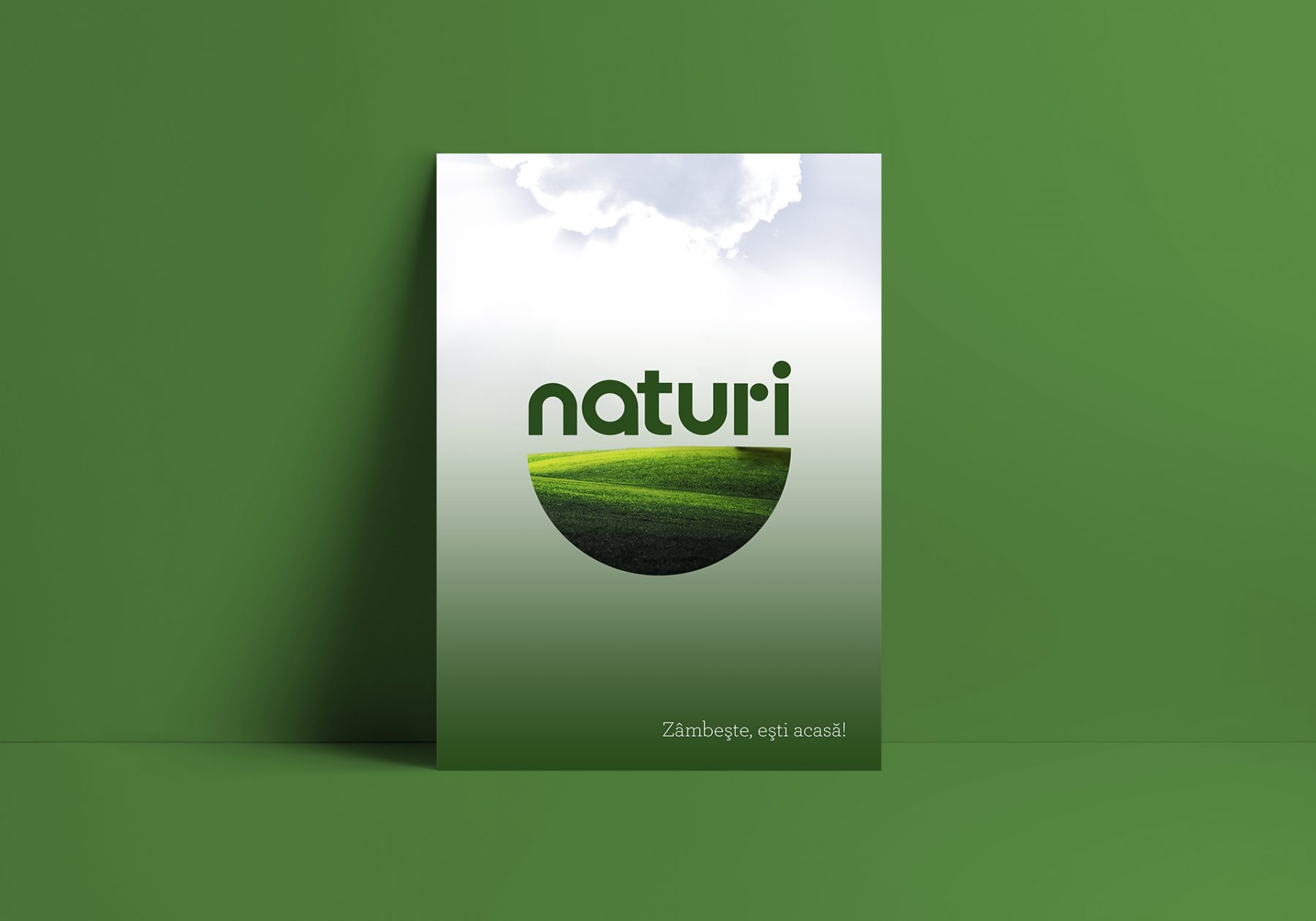
With a significance associated especially with the plant world, green is the second color, after blue, at the top of people’s preferences. Green is part of our lives and, whether we realize it or not, it influences us positively. Green represents nature, spring, balance, rebirth, renewal, and revitalization. In our project, the choice of green for our dynamic logo is not arbitrary; it is a deliberate choice to align ourselves with these positive connotations and convey a message of growth, sustainability, and a commitment to nurturing the well-being of both our audience and the environment. Green is more than just a color; it’s a symbol of our shared journey towards a better, greener future.
Did you enjoy what we created for Naturi?
Discover our branding for Go Veggie or the packaging design for tasty GoBar. If you’d like to discuss how we can transform your brand too, visit our contact page. You can explore more stories about our award-winning projects — including Spumos and Pizzeta – Silver, Dieline Awards 2026, Blue – Gold, Transform Awards Europe 2025, SanoVita – Pentawards Bronze and CridaPharm – Pentawards Bronze — on our blog.
Long-term results and other certainties:
- The dynamic “Naturi” logo has improved the level of consumer engagement and attitude towards the brand.
- The degree of flexibility has increased the marketing performance in a variety of environments, contexts and specific applications.