Romania’s fame for its traditional plum brandy, commonly referred to as “tuica,” is well-established and consistently draws a steady stream of tourists each year. Our specific focus in this project involved the development of a distinctive brand name, the design of a captivating product logo, the creation of a master label, and the establishment of a foundational visual identity for a range of products within this category. This project underscored our proficiency in both packaging design and branding, as we aimed to enrich the consumer’s connection to this cherished Romanian tradition while ensuring a memorable and authentic experience.
Sordony
Sector
Alcohol
Services
Brand Strategy
Naming
Logo Design
Packaging Design
Marketing Materials
DTP
Sordony
Celebrating Romania’s Essence: The Horezu Rooster
The Horezu distillery was founded in 1870 by a Greek boyar named Sordonie. Today, Cătălin Șoarece and his family continue the tradition of producing high-quality plum brandy in the commune of Stroiești, using a recipe passed down through generations. Each batch is distilled over a gentle flame, with careful attention to detail and quality.
Our task was to create a brand name and label design that would set the traditional plum brandy apart from others in the market. The design needed to convey a sense of premium quality, while also appealing to consumers in the medium-segment of the market.
Heritage Brandy Packaging Design
After analyzing the competing products in the segment, we discovered that most of the producers prefer visual solutions that have become classic for this type of product: a soft texture to evoke the feel of a natural and home-made product, and engraving-stylized illustrations to create an impression of being transported into the past.
To create a unique and pronounced character and mood for the brand, distinguish the product from its competitors, attract attention, and facilitate a dialogue between the brand and consumers, our goal was to preserve and convey Horezu culture and traditions.
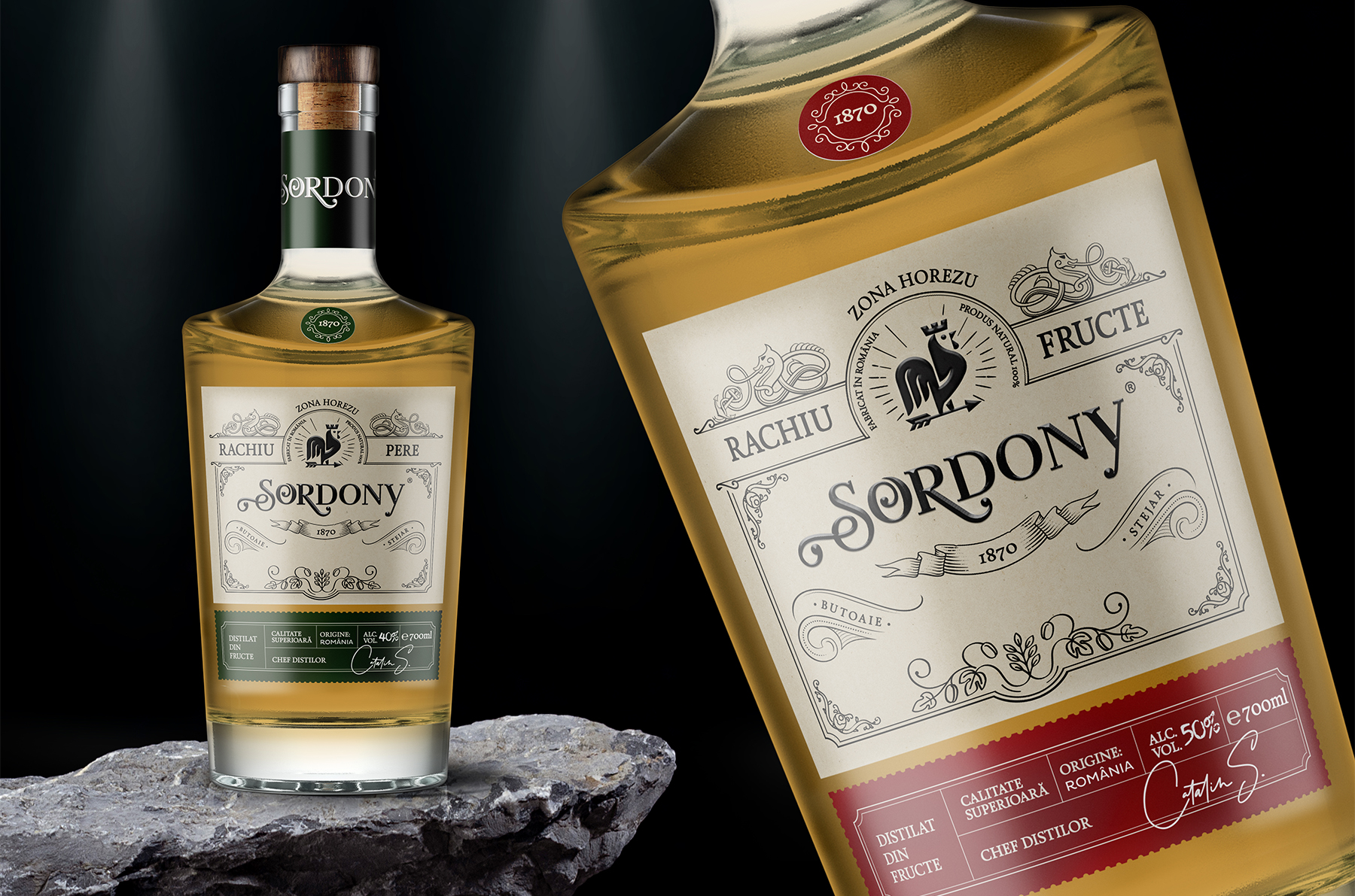
The top part of the label is dominated by the engraving illustration of the famous Horezu Rooster, the emblem of Horezu, symbolizing victory and the triumph of light over darkness. Our design takes a departure from the classic approach and boldly introduces bright, vivid colors and a modern geometric pattern inspired by traditional Horezu ceramics. The combination of the old and the new creates a fresh and dynamic visual language that speaks to a young and modern audience while remaining true to Horezu’s rich heritage
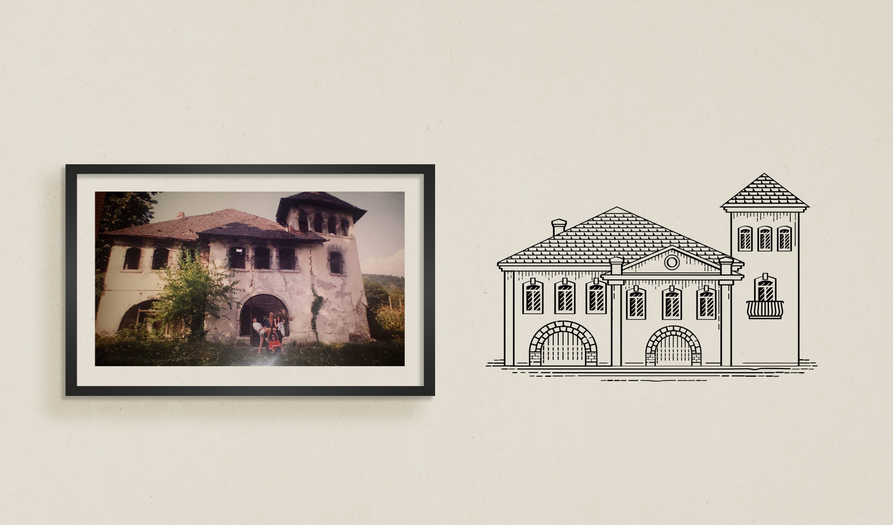
Creating a home plum brandy isn’t a joke. Creating the label design isn’t either.
For every master, it is extremely important to leave a legacy, to ensure that their experience and knowledge are passed to future generations. While scientific minds record their legacy, Sordony creates it with his own hands. His legacy is the taste of the unique blend of home plum brandy; the taste that will be loved and remembered. The national award received for another alcoholic beverage project caught the attention of Cătălin Șoarece, sparking his curiosity and interest in the world of spirits and mixology. For the BroHouse team, it presented an extra challenge to establish our presence in the field of alcoholic beverage packaging design.
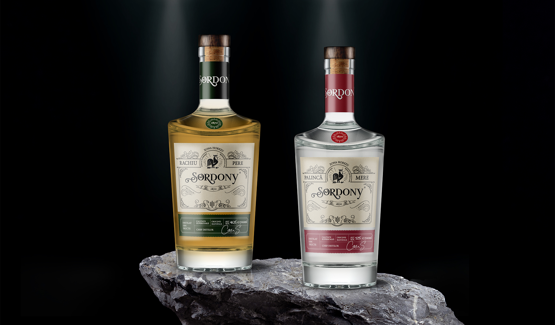
Label design: Țuică, Rachiu & Palincă
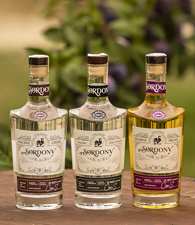
Drawing inspiration from vintage book covers and print productions, our label design for Țuică, Rachiu & Palincă combines several typographic compositions with conceptual texts to initiate communication with customers. The dark satin backgrounds and emboss create a pleasant play of light, accentuating the rich flavor of the product and setting it apart from its competitors. Despite the abundance of details, the label’s composition is perceived as a unified and harmonious pattern. The title is crafted in glossy varnish, while the rest of the label is printed in matte.
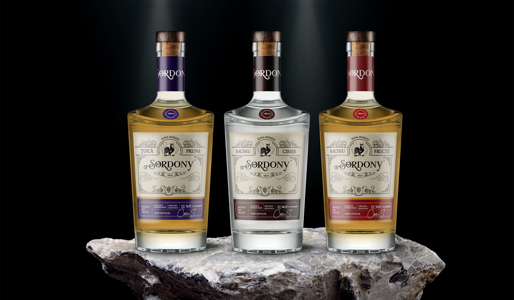

Packaging design guidelines
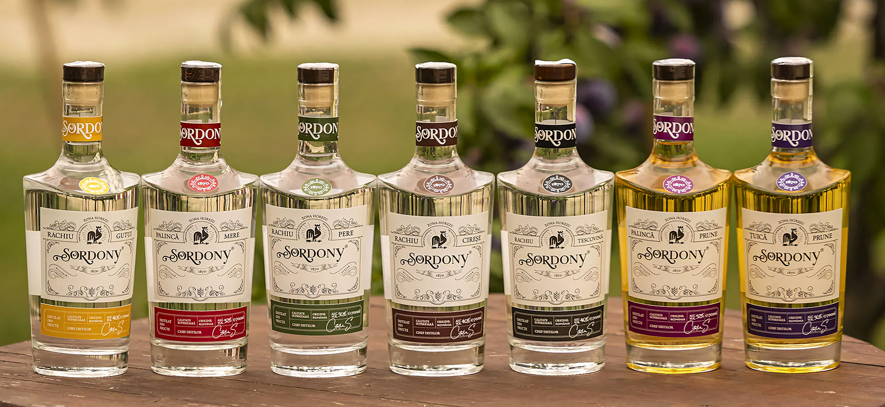
Label design guidelines: Our task was to develop a universal layout that would bring different alcohol products (Tuică, Rachiu & Palincă) under one line through graphic design. The final product had to fit the mid-priced segment of the Romanian alcohol market. The line also had to be adaptable to potential increases in product variety, so the label design had to be easily adjustable.
The body label is divided into two parts. The first part establishes the label’s mood, while the second part contains all the technical information. The background color of each label acts as a category identifier.


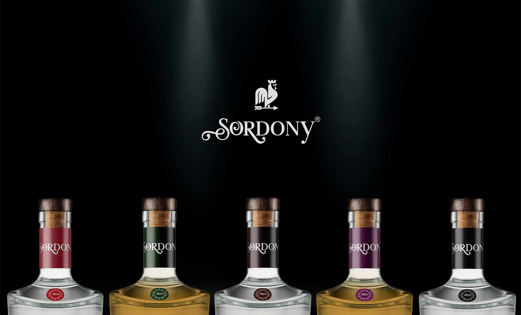
Long-term results and other certainties:
- The flexibility of the master packaging allows the continuation and expansion of the Sordony portfolio with new home brandy types.
- The final product was well-received by the target audience and quickly gained a stable position in the market. We were thus able to create a design that stands out on the store shelves and is easily distinguishable from its competitor
- Increased visibility on the shelf.
- The articulation of the philosophy on which the Sordony brand was built.

