Turabo was founded with a simple aim: to infuse their packaging design with positive vibes and boundless optimism. Life can be challenging and full of setbacks and we are constantly surrounded by negativity and voices that stop us from pursuing our dream. But we at Turabo believe that anything is possible if you put your mind to it. They understood how important it is to believe in yourself and to follow your dreams. Therefore, they believe that they can make a difference. They can be that voice that inspires people to do what they love.
Turabo
Sector
Coffee Drinks
Services
Rebranding
Brand Strategy
Logo Redesign
Brand Tagline
Packaging Design
Marketing Materials
Brand Guidelines
DTP
Turabo
A mark ready to inspire you
While aiming to fix issues of visibility, modernization, and consistency along all brand manifestations, the rebranding set out to better signal the new stage and status of the Turabo brand. There was only one possible way of doing this: by reinventing the brand and going back to basics. An inviting story that would once again enable restoring that connection with so many customers.
The new brand is rooted in its past and inspired by its future.

Slightly different but looking forward
The redesign process aimed to capitalize on the familiarity of the customers with the current brand elements, namely the brand name, the chromatic palette, and the logo structure, but also to permeate them with the new brand promise and enliven them to the rhythm of the modern customer.
The new logo “Turabo” aims to bring new emotions to customers. The buyer should be involved not only in the purchase process but also in the process of unpacking the product. The new brand identity captures the essence of the previous brand “Turabo” and appeals to an audience on a global level.
The main challenge was to preserve the brand equity accumulated by the old symbol and other brand property elements while introducing a new spirit of dynamism and increasing brand visibility. The new logo retains the elements that have become familiar and been ingrained in our audience’s mind. The typography system was overhauled, able to inspire and sustain order, especially when constructing large identity systems intended to work in demanding environments.
Better me, a better you
Turabo believes that great coffee isn’t just a beverage; it’s an experience that has the power to enhance your mornings and brighten up your entire day. For more than a decade, Turabo has been passionate about coffee and has used it as a source of inspiration to connect with colleagues and loved ones.
Their commitment to excellence is reflected in their approach to coffee-making, which is characterized by care, attention, and a focus on making the world a better place. For Turabo, it’s all about the people. Their aim is not merely to run a coffee business; it’s to delight their customers with exquisite, timeless flavors that surprise and delight. If even a single customer is inspired to follow their dreams or pursue their passions, Turabo sees that as a success!
The experience gained from 2 other similar projects in the coffee sector, WebCoffee and Del Conte, has given us the confidence and courage to dare more.
Telling a story through illustration & packaging design
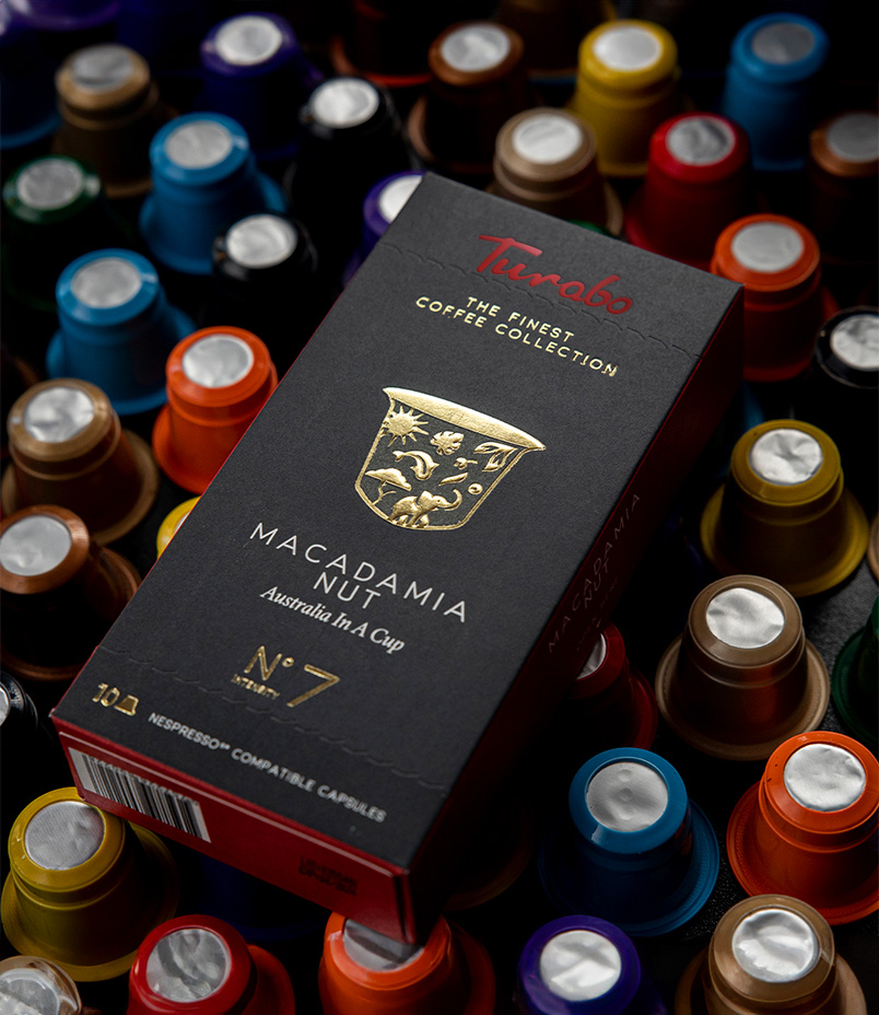
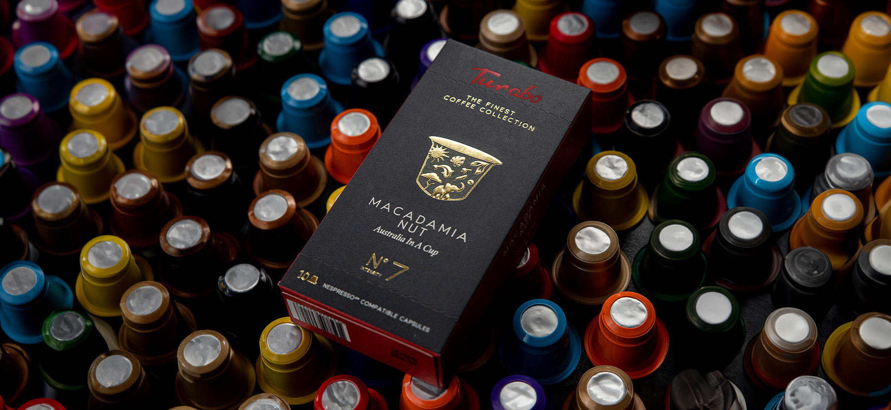
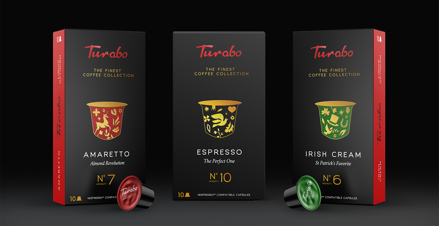
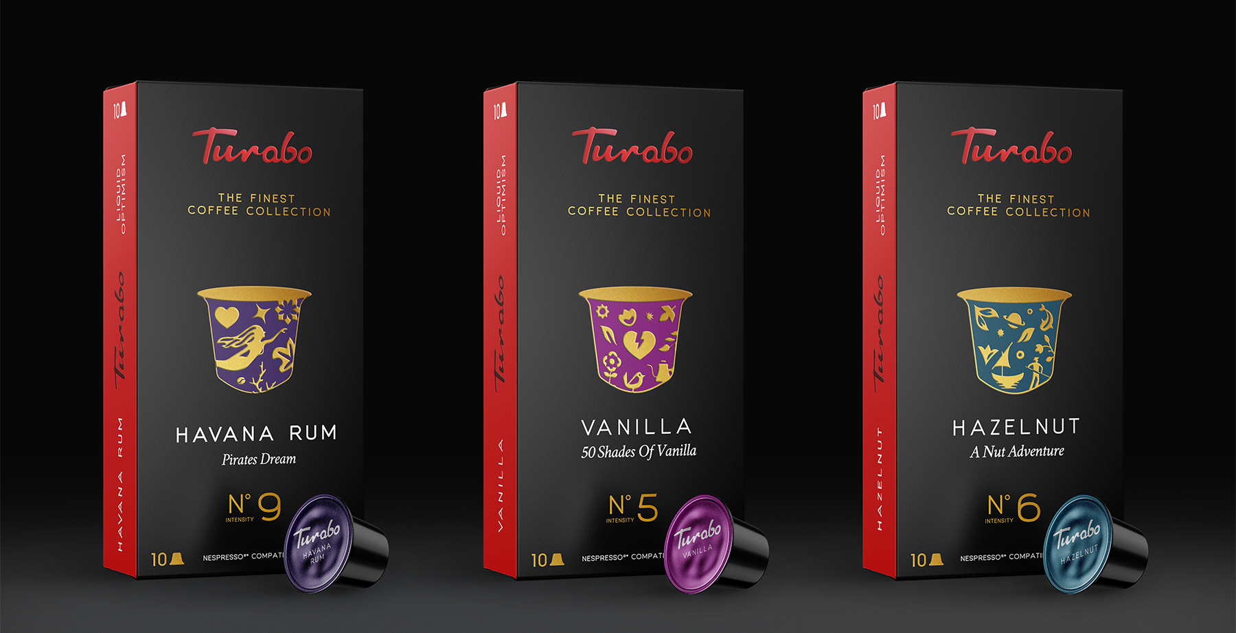
The packaging design for Turabo coffee capsules features an original story that highlights the everyday power of coffee. Through charming illustrations, it showcases how enjoying a cup of coffee during ordinary moments can transform them into special experiences. The use of a specific color illuminates the optimism that exudes from every single capsule.
The design is simple, clean, and easy to understand, standing out from other products in the category through its elegance. The typography system was also overhauled to inspire and maintain order, particularly when constructing large identity systems intended to work in demanding environments.
Flexible master packaging
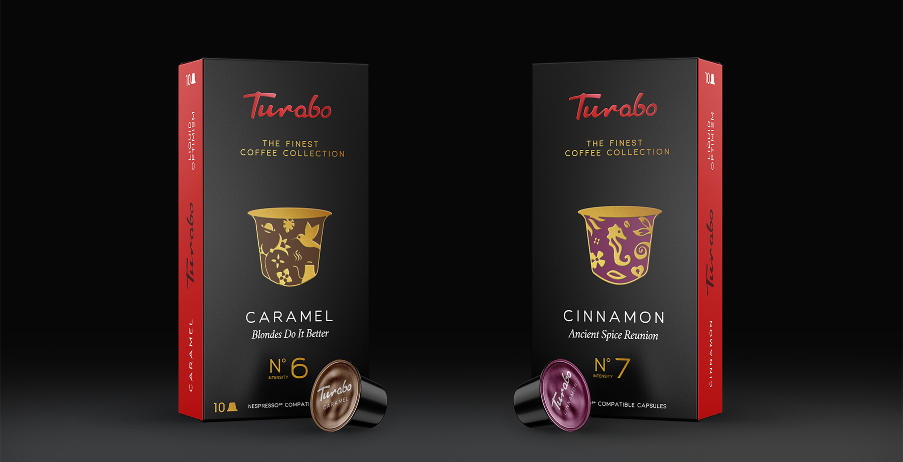
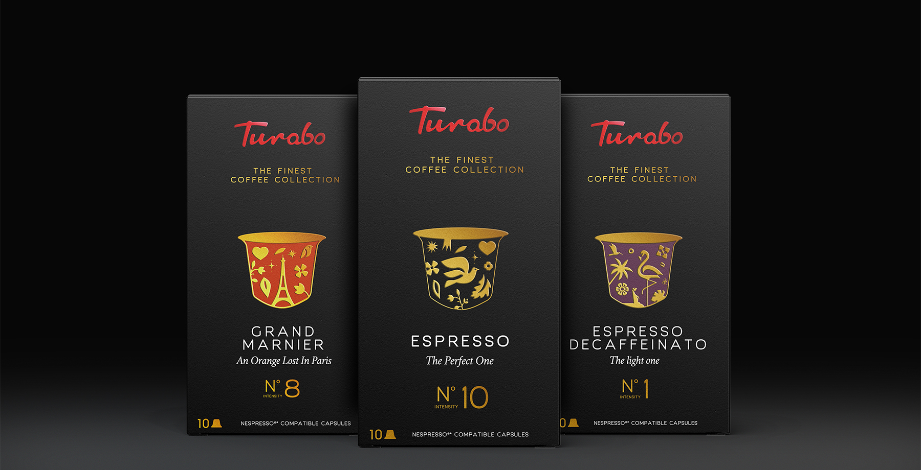
To achieve this objective, a comprehensive graphic concept was developed to effectively support the entire range of Turabo’s 15 coffee products. The packaging design for each label is consistent with the overall “master packaging” solution while incorporating unique elements specific to each product without compromising the Turabo brand’s recognizability and familiarity. This approach allowed for a cohesive visual identity across all products while still maintaining their individual characteristics.
Brand Slogan: “Liquid Optimism”
Our new communication platform is based on a simple concept that can be easily adapted to various communication needs. It applies to everything our brand touches, from website copy, packaging, social media posts, and blogs. The messages are built to speak to our audience’s beliefs, not just intentions, conveying the essence of our brand and creating acceptance.
We recognize that 2021 has been a rollercoaster ride for everyone, but we want to remind you that you made it through the year and should be proud of yourself. The world is vast and full of kind people, so never forget that you’re never truly alone, and there’s comfort to be found in others, even when you’re at your lowest. In today’s social media-driven world, it’s okay to move in silence and focus on your own journey.
Remember, as long as you’re happy, do what makes you happy. Your happiness matters the most, and there’s nothing wrong with dreaming and working towards achieving your goals. Let’s make those dreams come true together!
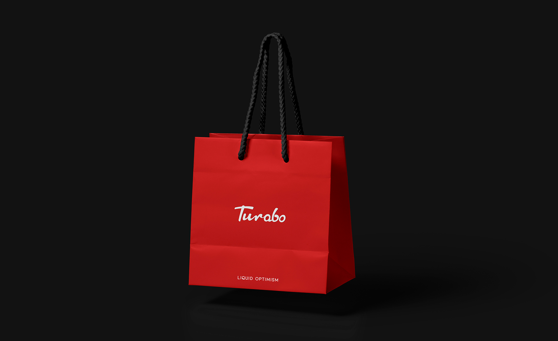
Our Red is iconic
Our core palette comprises red, black, and white. The inseparable combination of black and red is used predominantly in any form of marketing & stationery
- Red Colour: Our red is iconic. It’s our most identifiable asset, from the color of our aprons to our logo. Red is used sparingly, accenting the simple, confident palette.
- Black Colour: We are a dark, premium brand that uses color in a contemporary, sophisticated way. The deep black color is a celebration of coffee, evoking a sense of a confident company that values its customers and the quality of its products.
- White Colour: A foundational piece of our brand and logo. Use as needed for type, backgrounds, and more. The white color brings freshness and balance to the logo.

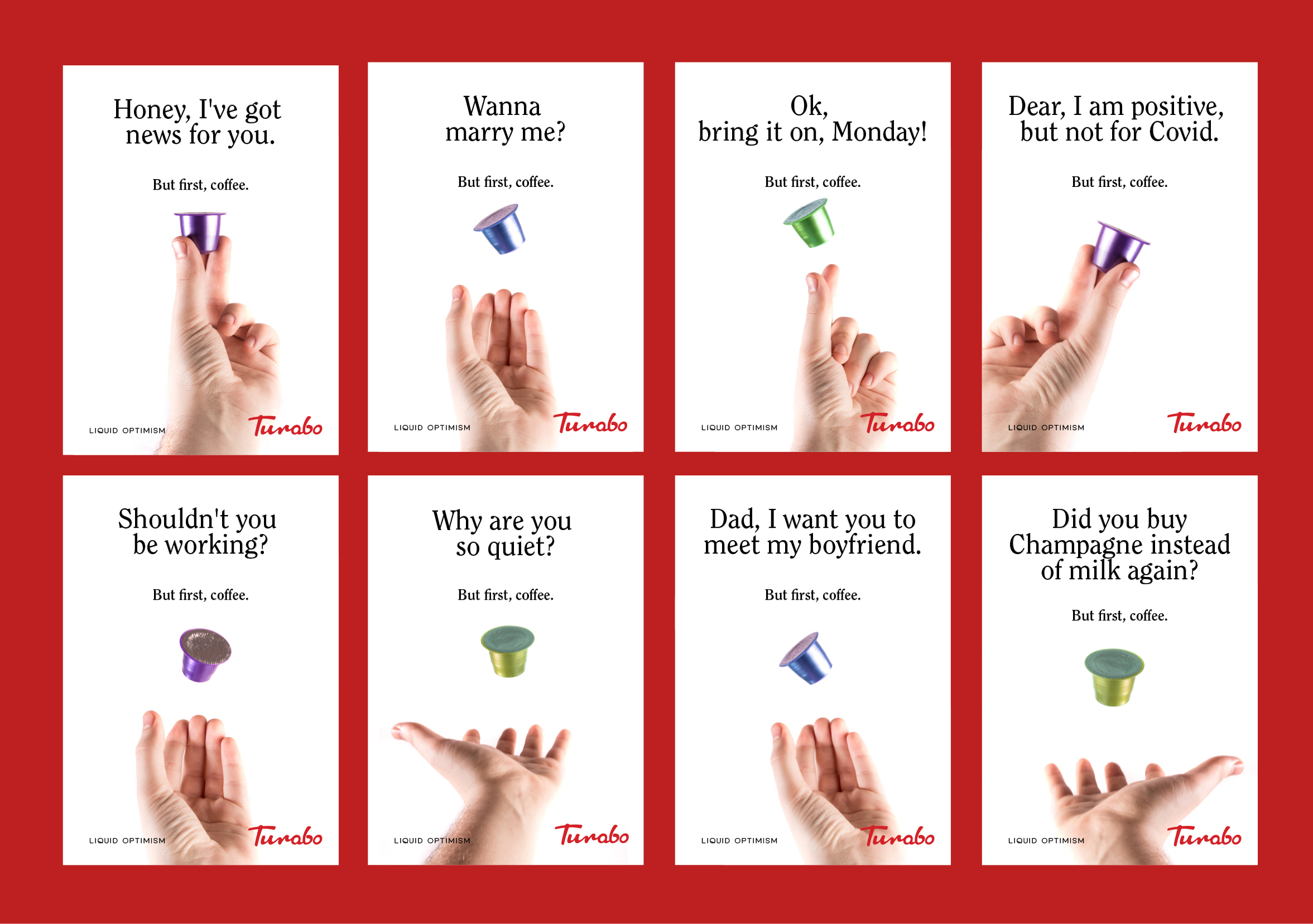
Brand Message
People often feel overwhelmed when making decisions. Having a positive mindset is crucial in analyzing and choosing between alternatives in all aspects of life, whether it’s your love life, family, work, or friendships. Being constantly cranky or blue won’t get you far. We all have bad days, but maintaining a positive attitude gives us clarity and enthusiasm.
The informal language adds a sense of accessibility, and the humility breaks down barriers. Repetition builds trust and increases awareness.
Welcome to the Turabo Brand Guidelines
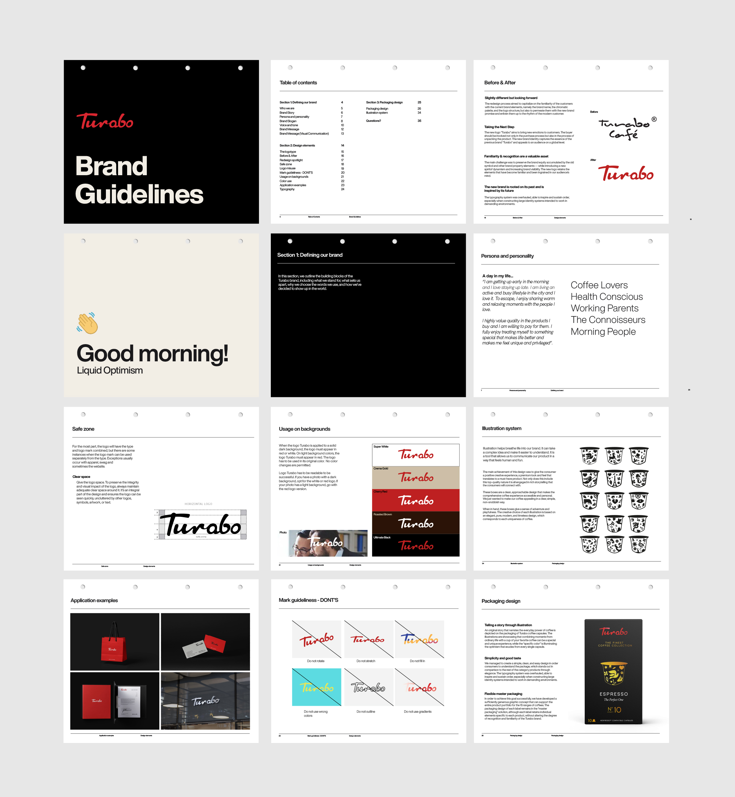
Here you’ll find everything you need to know about the brand “Turabo”, as well as how to use it. Turabo’s packaging is your most visible brand asset. It needed to be presented consistently and coherently. The packaging guidelines were created to ensure that all graphical representations of the brand were executed correctly, efficiently, and, most importantly, easily.
The result was a series of design principles that would underline the entire suite of products.
