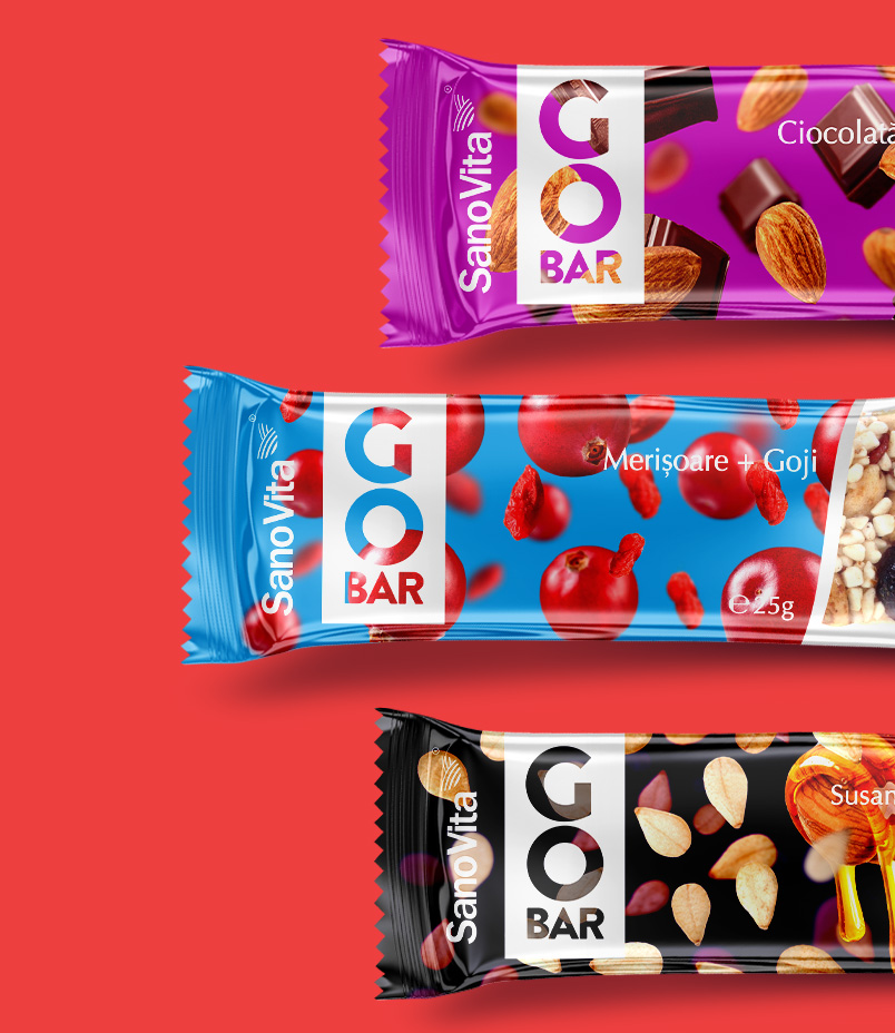
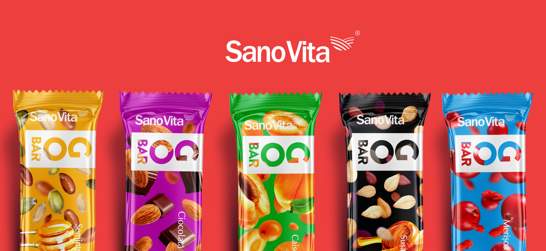
SanoVita, the manufacturer based in Valcea County, introduces its comprehensive range of ‘GoBar’ snack bars, comprising five distinct variants featuring diverse blends of cereals, fruits, and seeds: blueberries and goji, sesame and honey, apricots and seabuckthorn, chocolate and almonds, as well as seeds and honey. BroHouse has taken on the task of crafting the packaging design for GoBar mix bars. Our objective was to develop a packaging solution that not only highlights the competitive attributes and strengths of the SanoVita brand but also aligns seamlessly with the world of packaging design and branding
Go Bar
Sector
Nutrition Bars
Services
Brand Strategy
Logo Design
Packaging Design
Marketing Materials
DTP
Go Bar

Packaging design communicates the product’s essence when words cannot
Ever since we were told never to judge a book by its cover, yet the temptation remains there. And when it comes to a food product that we want to buy, the role of packaging design plays a crucial role. The first step is to make sure we have a complete picture of the four success indicators of any packaging design: function, cost, scalability and brand alignment.
In order to solve this packaging solution, it was necessary to create a concept that was generous enough to support the entire GoBar product portfolio. Although each product has received its chromatic and meaningful identity, and all products are part of the same conceptual approach, bringing together all visual solutions under a single unitary concept.
The solution created is providing information on the nature and qualities of GoBar products, continue to support the values of the manufacturer Sanovita. The visual language of each solution transmits a unitary emotional appeal that allows the consumer to feel the benefits and diversity of the GoBar – SanoVita bars.
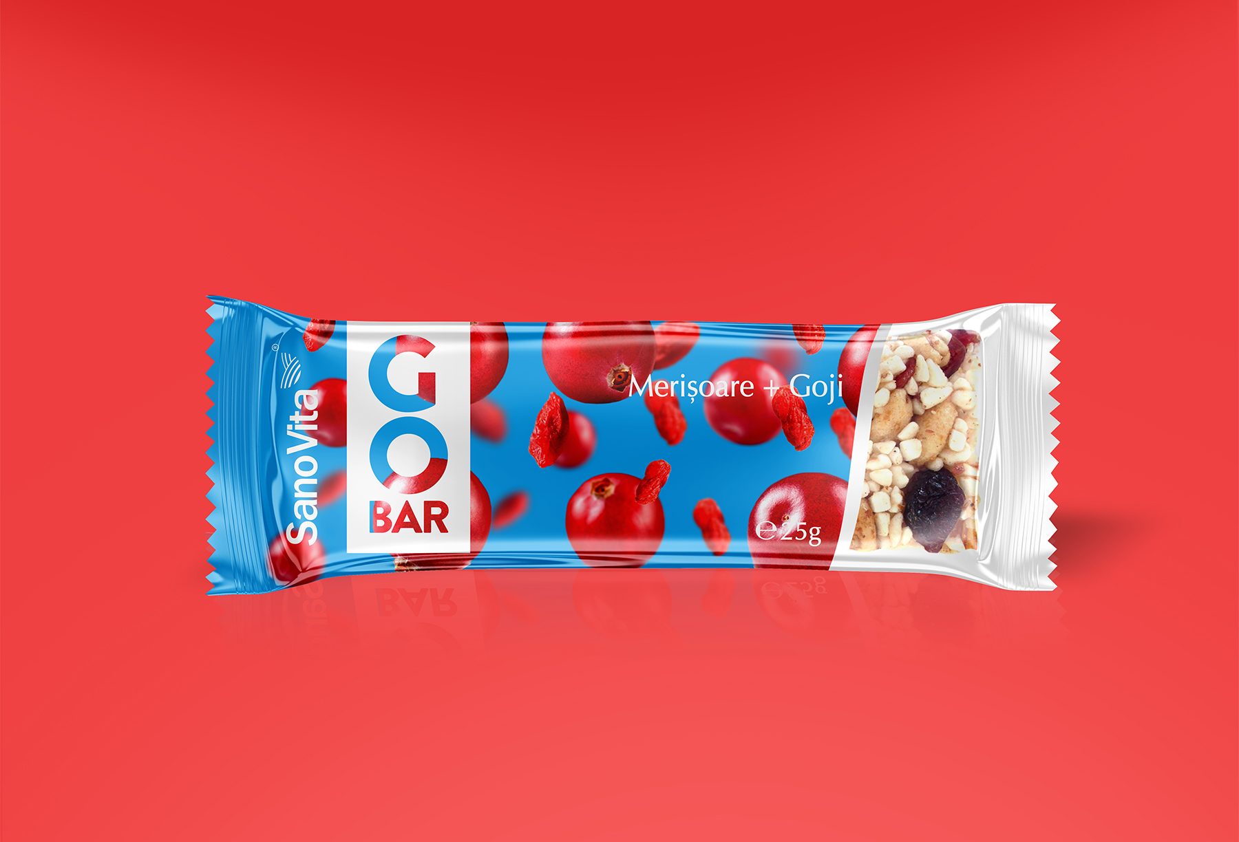
A journey with SanoVita: collaborative success in Packaging Design
We’ve had the opportunity to collaborate with SanoVita on several projects, including the creation of vegetable pate, branded as VegieLife, and the development of GoBar protein bars. These experiences have significantly enriched our understanding of the challenge at hand. These experiences have become pivotal chapters in our ongoing narrative, forging a path of innovation and creativity as we continue to explore new horizons in the world of packaging design.
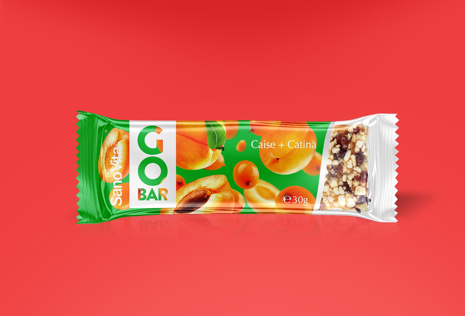
Packaging design unity: elevating GoBar’s brand recognition
To address this intricate packaging challenge effectively, it became imperative to craft a concept with the versatility to accommodate the diverse GoBar product range. While we meticulously bestowed each product with its distinctive color scheme and meaningful identity, our overarching objective was to unify them all under a coherent and cohesive conceptual framework.
This approach ensured that, despite the unique attributes of each product, they all harmoniously coexisted within a single, unified concept. By doing so, we not only maintained the individuality and essence of each GoBar variant but also created a strong, collective visual identity that strengthened the brand’s presence on store shelves and resonated powerfully with consumers. The result was a packaging design that both celebrated product diversity and conveyed a sense of unity and brand consistency, making GoBar an unmistakable and inviting choice for customers.
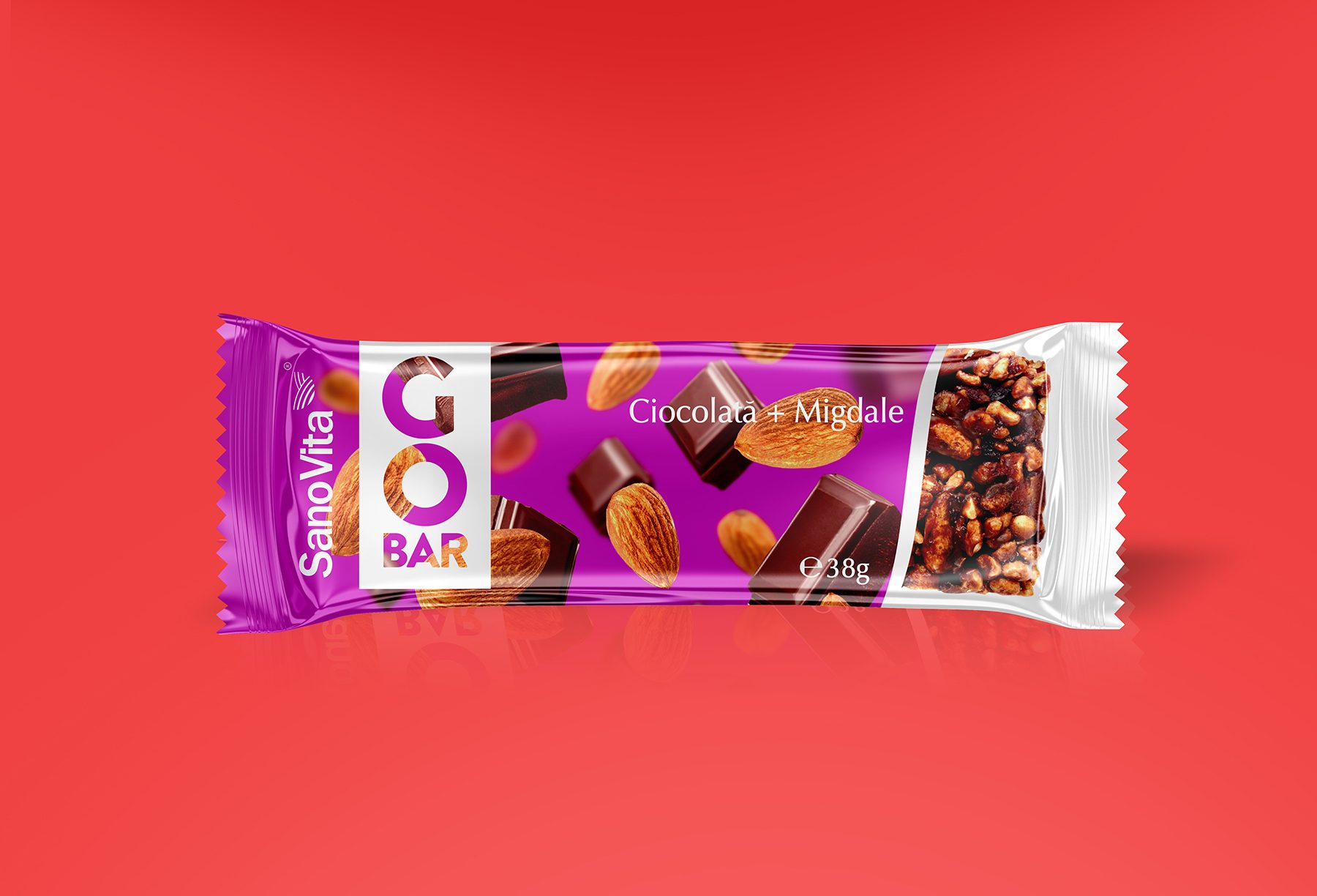
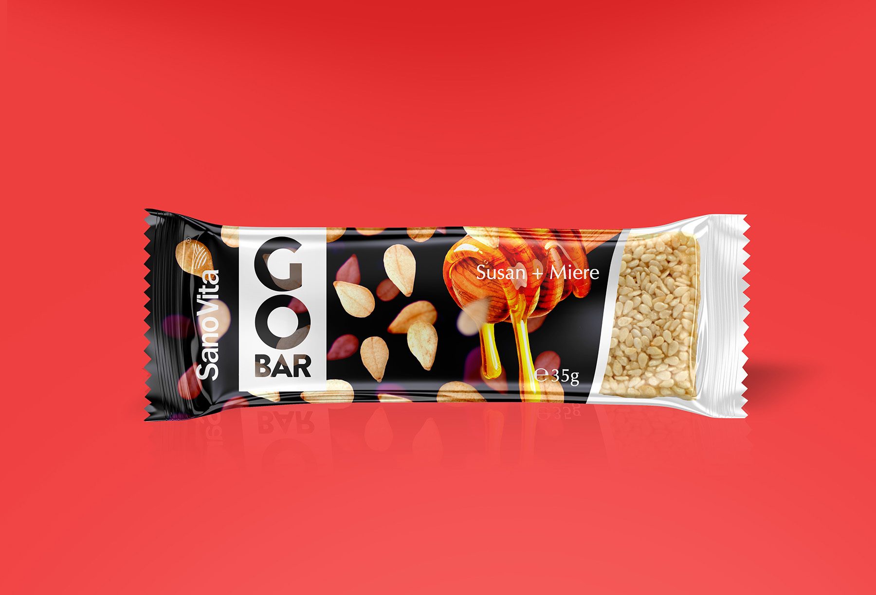
This strategic approach guaranteed that, despite the unique attributes of each GoBar variant, they all harmoniously coexisted under the umbrella of a single, unified concept. The outcome was a packaging design that not only celebrated the diversity of our product range but also conveyed a profound sense of unity and brand consistency, rendering GoBar an unmistakable and enticing choice for discerning customers.
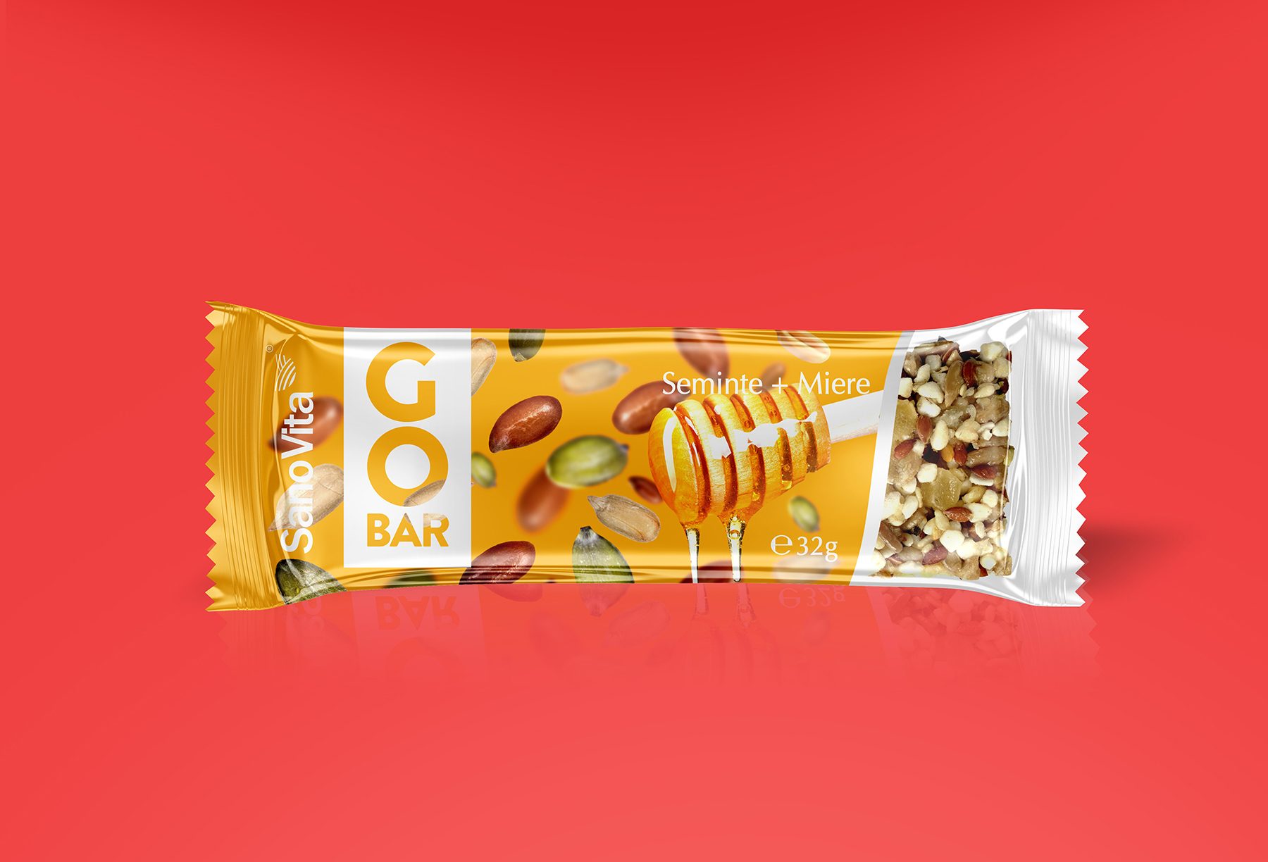
Long-term results and other certainties:
- The “master packaging” made for the GoBar mixing rod family can support further execution and addition of new rods within the same categories.
- Maximizing shelf visibility by increasing the degree of testing, especially for new consumers.
- Increasing the image brand of the SanoVita, preserving the spirit and personality of the brand.
