Flash Automate is a company with a comprehensive vision and a remarkable 27-year track record in marketing, distribution, and coffee espresso machines. Naturally, within Flash Automate’s extensive portfolio emerged the Del Conte brand, driven by the market’s demand for a premium product. Recognizing the need to enhance the perceived quality of their four product ranges, Del Conte embarked on a rebranding journey. To elevate the brand and packaging design for their coffee, tea, chocolate, and granulated milk products, the BroHouse team introduced a novel format, promising a fresh and invigorating experience for consumers across these four hot drink categories.
Del Conte
Sector
Coffee Drinks
Services
Brand Strategy
Logo Design
Packaging Design
Marketing Materials
DTP
Del Conte
A Symbol of Elegance to Begin Your Day
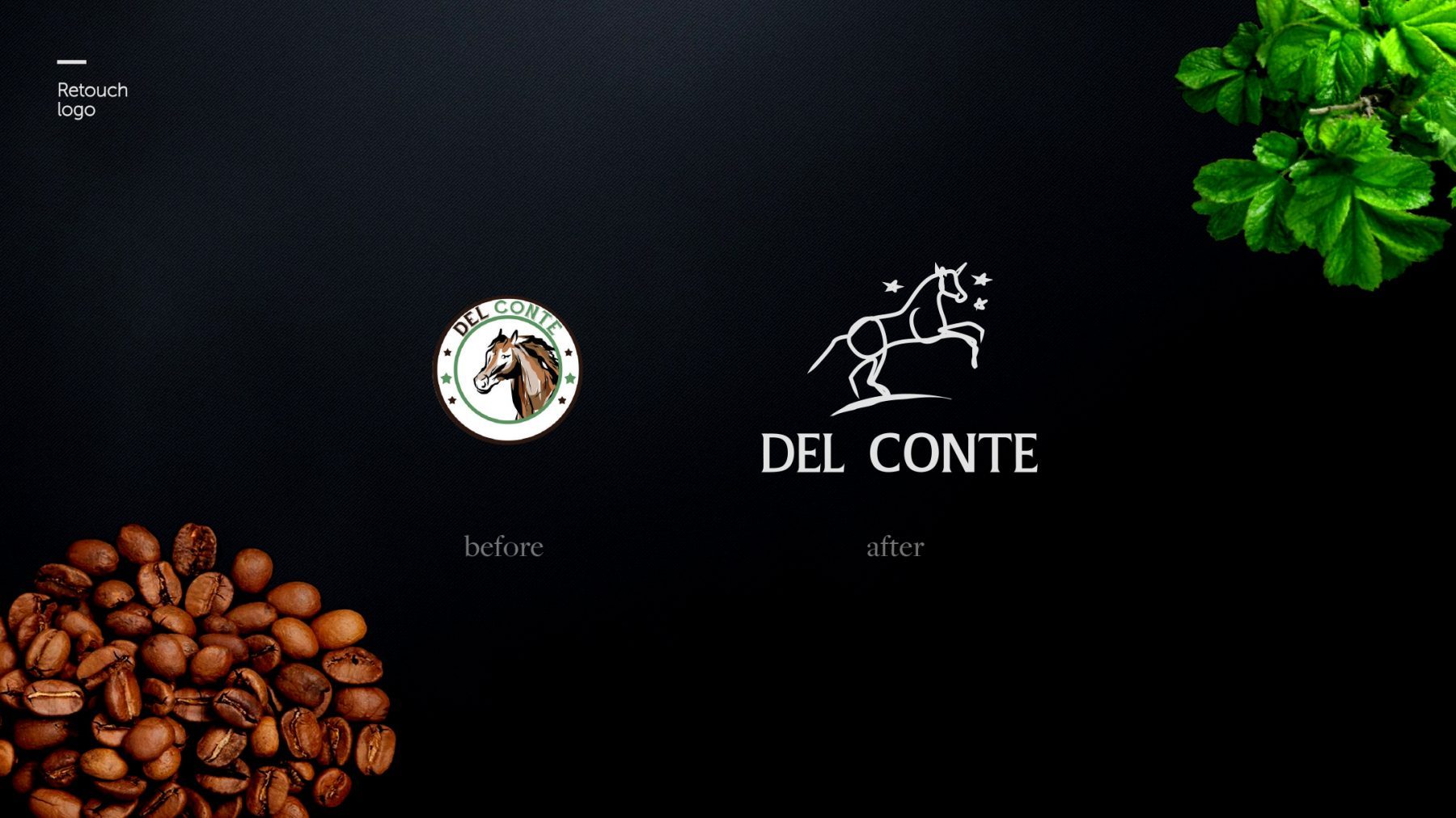
One of the key challenges we encountered in addressing Flash Automate’s brief was the need to reimagine the iconic “horse” symbol, imbuing it with an aura of exclusivity, prestige, and grandeur. The redesign of the Del Conte logo was a meticulous process aimed at elevating the brand’s essence to new heights. In our quest to maintain the essence of the original Del Conte logo, we embarked on a journey to amplify its premium qualities. The result is a redesigned logo that not only pays homage to its heritage but also amplifies the brand’s intrinsic allure.
The new Del Conte logo now embodies the very essence of exclusivity and distinction. It serves as a noble symbol, resonating with elegance and sophistication, perfectly reflecting the premium nature of the products it represents. Every curve and line in the logo has been meticulously crafted to convey a sense of power and superiority.
With this redesign, Del Conte’s commitment to offering select and superior products is made unequivocally clear. It’s a logo that not only stands as a symbol of excellence but also as an emblem of the brand’s dedication to providing customers with nothing but the finest.

If you don’t know already, coffee and design are complementing each other
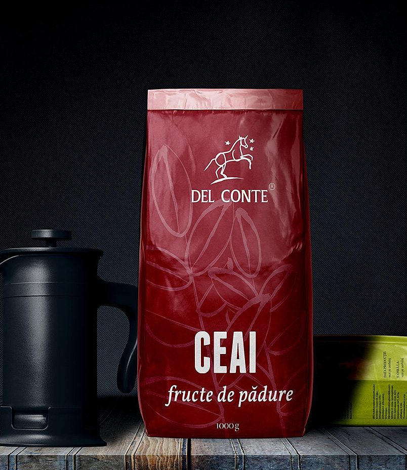
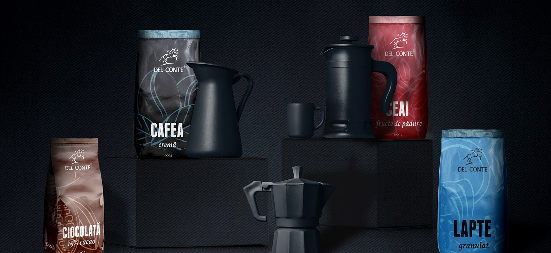
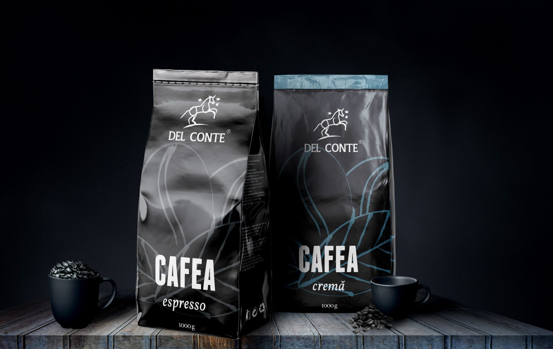
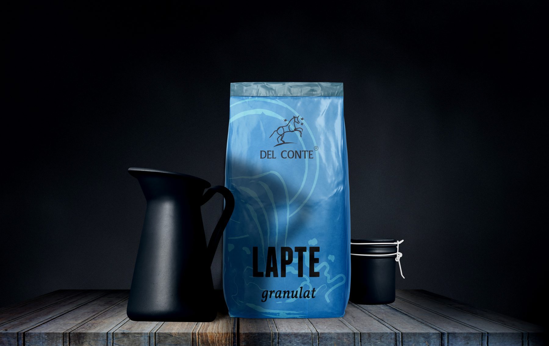
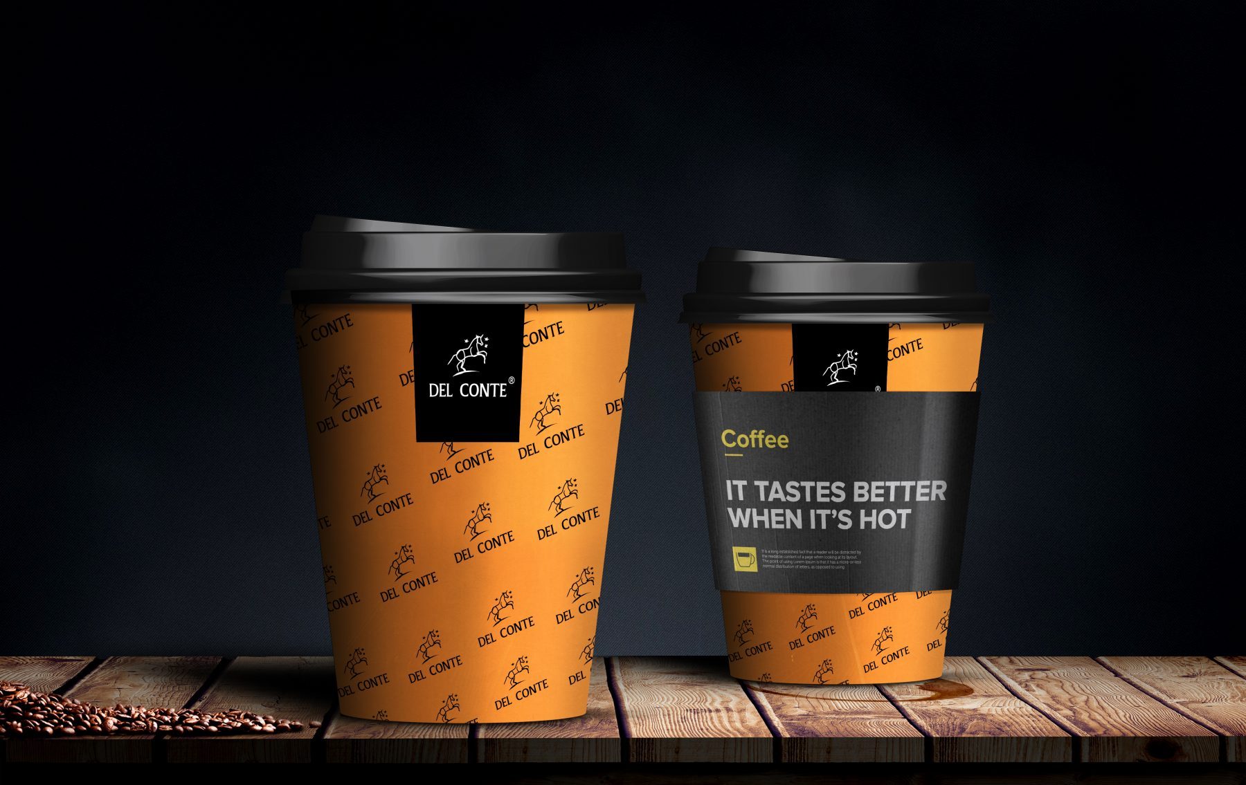
For the packaging design of the 4 hot drinks, we were influenced by the font and the authority of the name Del Conte. The 4 types of packaging design manage to provide a unique experience capable of capturing the essentials and eliminating any traces of unnecessary noise. The simplicity of the shapes and the colour palette expresses the spirit of the Del Conte brand, which successfully communicates the benefit and the difference between the four products.
To validate the final solution, we designed a series of 3D simulations, which helped the customer to see the space product, to imagine it on the shelf and interaction with consumers. Graphic solutions for aluminized plastic packaging necessitate special attention, which is why it was mandatory to perform a series of print tests.
It’s not an arrogant position, it’s exactly what the consumer would naturally say when describing the Del Conte product. The result is a simple, elegant and powerful brand that strengthens the product. The aromas are carefully preserved, waiting to be released! Take your cup and enjoy of our 4 flavours.

Drawing from the insights gained through two comparable coffee projects, WebCoffee and Turabo Capsule, we have successfully painted a more vivid portrait of the coffee market and the coffee consumer profile. These previous experiences have been invaluable in shaping our approach to the current project, providing us with a wealth of knowledge about market trends, consumer preferences, and effective strategies



Long-term results and other certainties:
- The rebranding has increased the perception of quality on the products.
- The brand identity expresses the brand promise in the premium segment of hot drinks.
- The visual perishability of packaging design solutions, without being “used” psychologically over time.
- Flexible master packaging that allows the extension of the brand into different categories.

